

Challenge
Employee Link is a workforce management app designed for business owners, managers, and employees to streamline scheduling, time tracking, and team coordination.
While the platform offered robust functionality, we saw an opportunity to improve how new users experienced their first moments in the app.
Our focus: make it easier for users to get started, understand the app's value, and convert with confidence.
Solution
1. Goals
The project centered around four key initiatives:
- Redesign the onboarding flow to reduce drop-offs, increase personalization, and drive early trial intent.
- Launch a new export timesheets feature, guided by user feedback and designed for fast adoption.
- Test and optimize the paywall experience, experimenting with different entry points, messaging, and layouts.
- Boost post-onboarding activation by introducing a Get Started flow that encourages immediate action and reveals product value quickly.
Our guiding principle throughout was simple: every screen should move users closer to value.

Typography & Color
2. Onboarding Flow
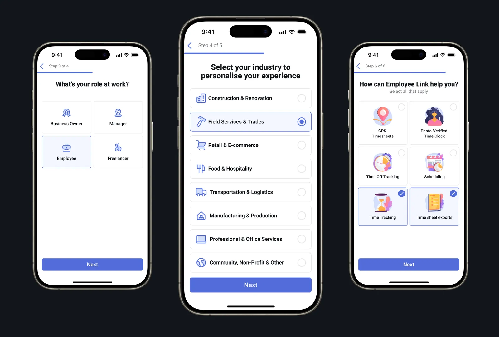
The original onboarding was short but lacked personalization, making it harder for users to feel connected to the app early on.
We introduced new screens to tailor the experience based on role, industry, and feature needs. Users now select whether they're a business owner, manager, employee, or freelancer, and choose their industry and top use cases-like GPS timesheets or scheduling.
These changes made the flow more relevant, and set the stage for better activation and engagement.
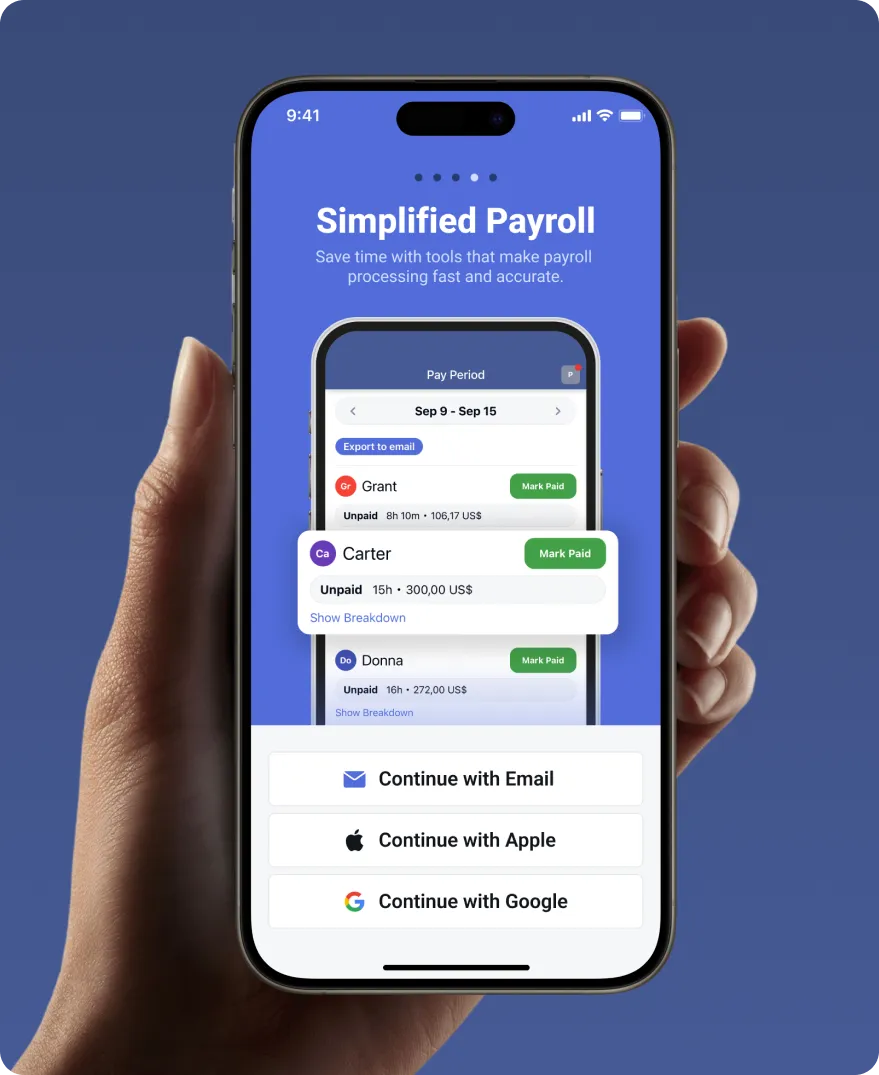
Simplified Payroll
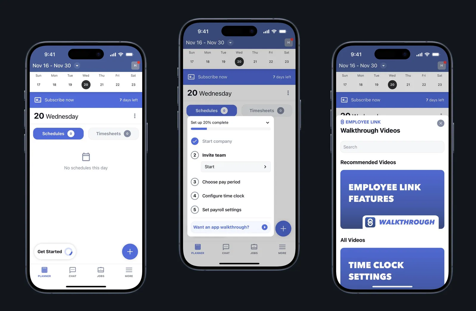
3. Post-Onboarding: Get Started Flow
After completing onboarding, users now see a "Get Started" popup that walks them through setting up their company in just a few steps. It's focused, friendly, and highlights how little time each task will take.
This flow was made mandatory to drive activation, and we paid close attention to drop-off points.
Initially, asking users to invite teammates too early led to friction-so we moved that step to the end of the setup sequence, after users had already configured key settings.
The result was a smoother path to value, with more users completing setup and exploring the app.
Before the Redesign
After the Redesign
4. Export Timesheets Flow
Exporting timesheets was one of the most requested features from users managing payroll and reports. Previously, users had no easy way to pull out logged hours in a shareable format-leading to frustration and support tickets.
We designed and built the export flow from scratch focusing on simplicity and clarity.
Users can now quickly select a date range, choose format (CSV or PDF), and generate timesheets in seconds.
5. Paywall Versions & Testing
Most of our testing focused on onboarding paywalls, where timing and clarity are critical.
We explored multiple versions, ranging from simple prompts to more dynamic formats across onboarding and in-app moments.
The most successful version was a table-style layout introduced during onboarding.
It clearly outlined the differences between core and pro, making the decision straightforward.
Users responded well to this level of transparency, and it consistently outperformed other formats in trial starts and conversions.
Results
The combined improvements across onboarding, activation, paywalls, and feature design led to measurable lifts across the funnel. Export feature engagement contributed to higher retention and repeat app usage:
ARPU saw a lift of 35%, indicating stronger monetization per user.
Onboarding completion rate improved by 15%, thanks to personalized steps and reduced early friction.
+35%
ARPU
+15%
Onboarding completion rate
Client feedback
The quality of their work is the best I’ve seen. Thanks to Applica, I've seen a 30% increase in product page views and downloads, as well as great improvements in revenue.
Morgan Trudeau
CEO at Magnify Technologies