


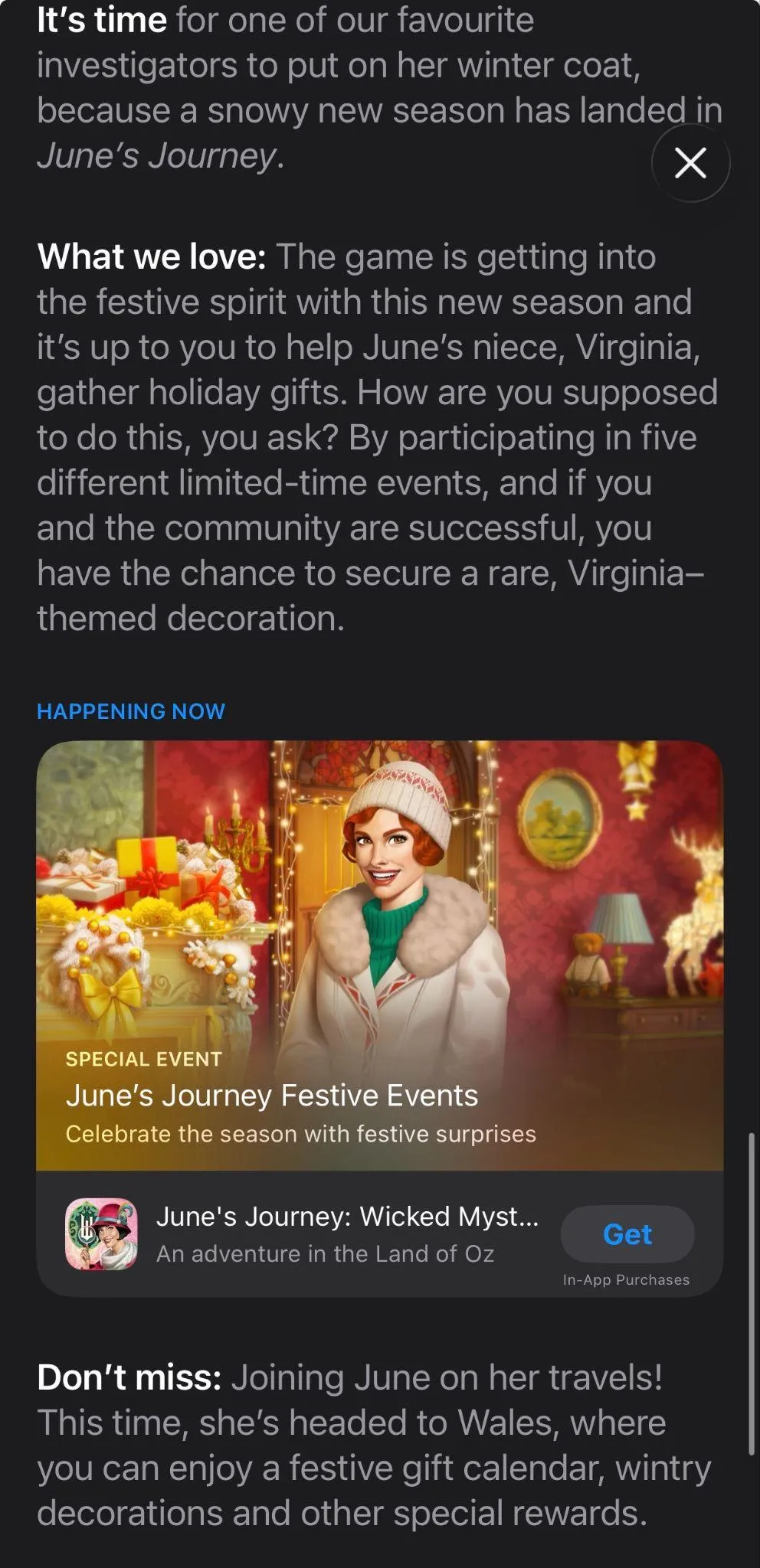
What's inside
A full seasonal ASO calendar from Halloween to Easter
Visual guidance for icons, screenshots, CPPs, and in-app events
Platform-safe do's & don'ts
Real-world examples from top apps
Please fill out the form to access the Playbook
A Seasonal ASO checklist you can reuse every season
Holiday-specific strategies for:
Halloween
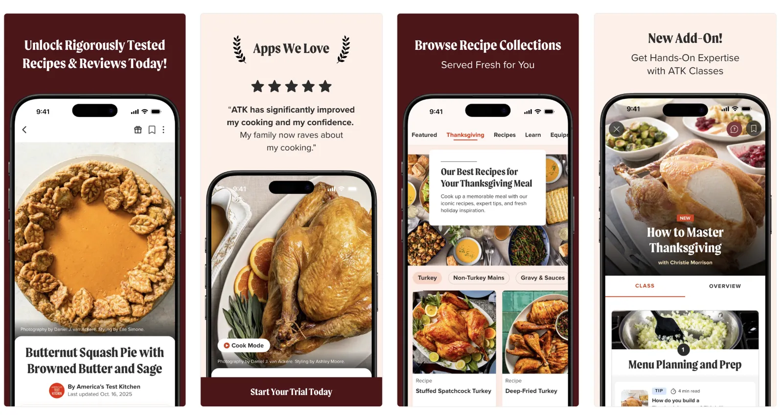
Thanksgiving
Black Friday
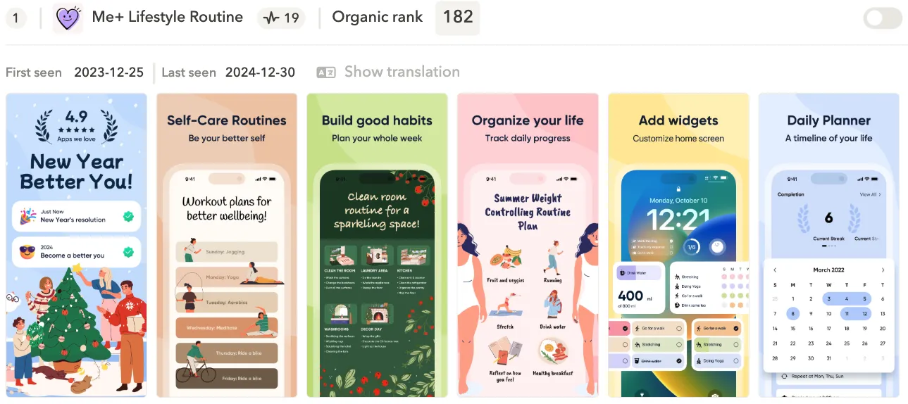
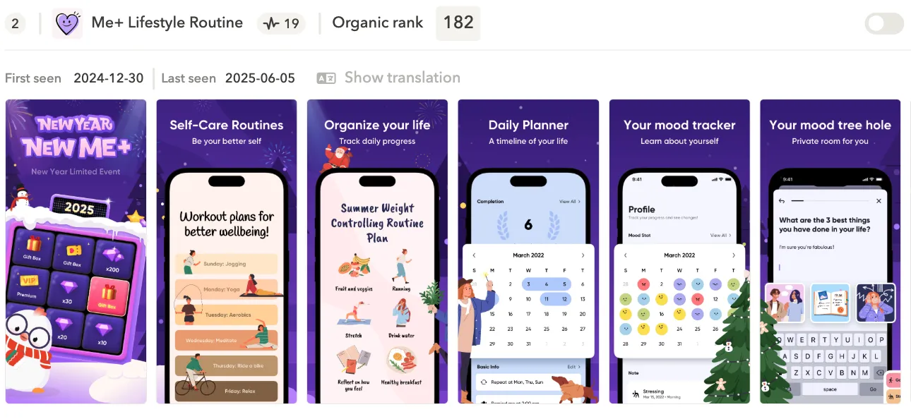
Christmas & New Year
Valentine's Day
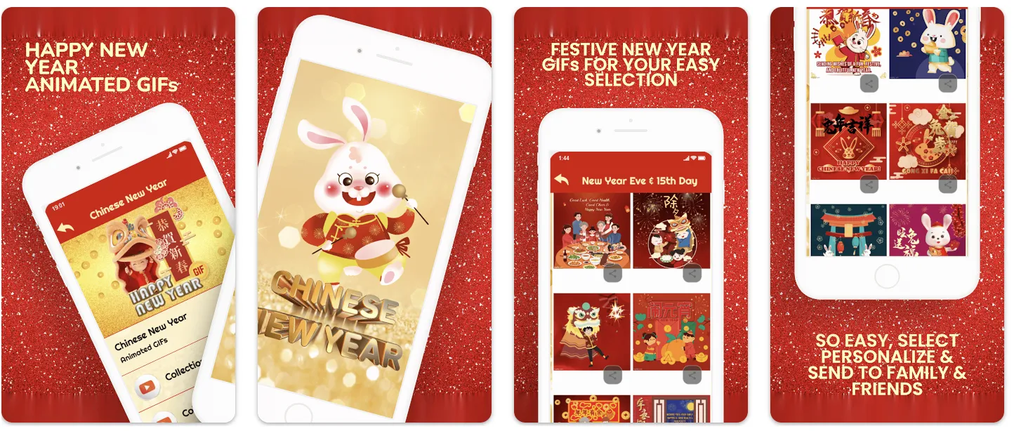
Chinese New Year
Easter
Who it's for
App marketers & ASO managers
Growth & performance teams
Product marketing managers
Mobile founders & product leads
Intro
Holidays and cultural events create predictable spikes in user interest on the App Store and Google Play. These moments affect what people search for and how likely they are to download an app. Apps that prepare for these spikes gain visibility and downloads, while those that don’t risk being overlooked. Seasonal ASO is about aligning your app store listing with what users are looking for at the right time.
In this comprehensive playbook, we look at the most popular seasonal moments, from Halloween to Easter, from an ASO point of view. For each holiday, we share practical insights, clear recommendations, and real examples of how top apps adjust their store listings for seasonal campaigns. The goal is to give you a simple, actionable guide to planning and executing seasonal ASO throughout the year.
Why Seasonal ASO Matters
You could say: why would I do something special for these holidays? My app store product page is already well-optimized.
That’s true, but during seasonal peaks, users behave differently. Search trends shift, themed visuals convert better, and app store traffic increases around certain holidays. Even a strong evergreen page can feel out of place when the entire category updates for the moment. And if you don’t adapt, your competitors almost definitely will. Seasonal updates help you stay relevant and very up-to-date for users, protect and maybe even boost your organic position, and capture demand that only exists for a short window.
Reasons why “evergreen” ASO isn’t enough
- Seasonal intent changes: Search behavior evolves depending on the moment, and standard app store page messaging doesn’t always match that.
- Trending keywords: Seasonal keywords help your app appear in searches that only spike for a short period.
- Fresh visuals stand out: Even small seasonal tweaks make your listing more eye-catching.
“This approach also allows you to re-engage users who have stopped using your app and churned. Once they see something new catching their attention, they might want to re-download.”
- Competitors are updating: Many apps treat seasonal ASO as standard practice. So if you choose to ignore it, keep in mind that your competitors won’t, and they’ll draw in users you could have captured.
- Better alignment with campaigns: Seasonal updates of your app store listing reinforce your promotions, in-app events, and special offers.
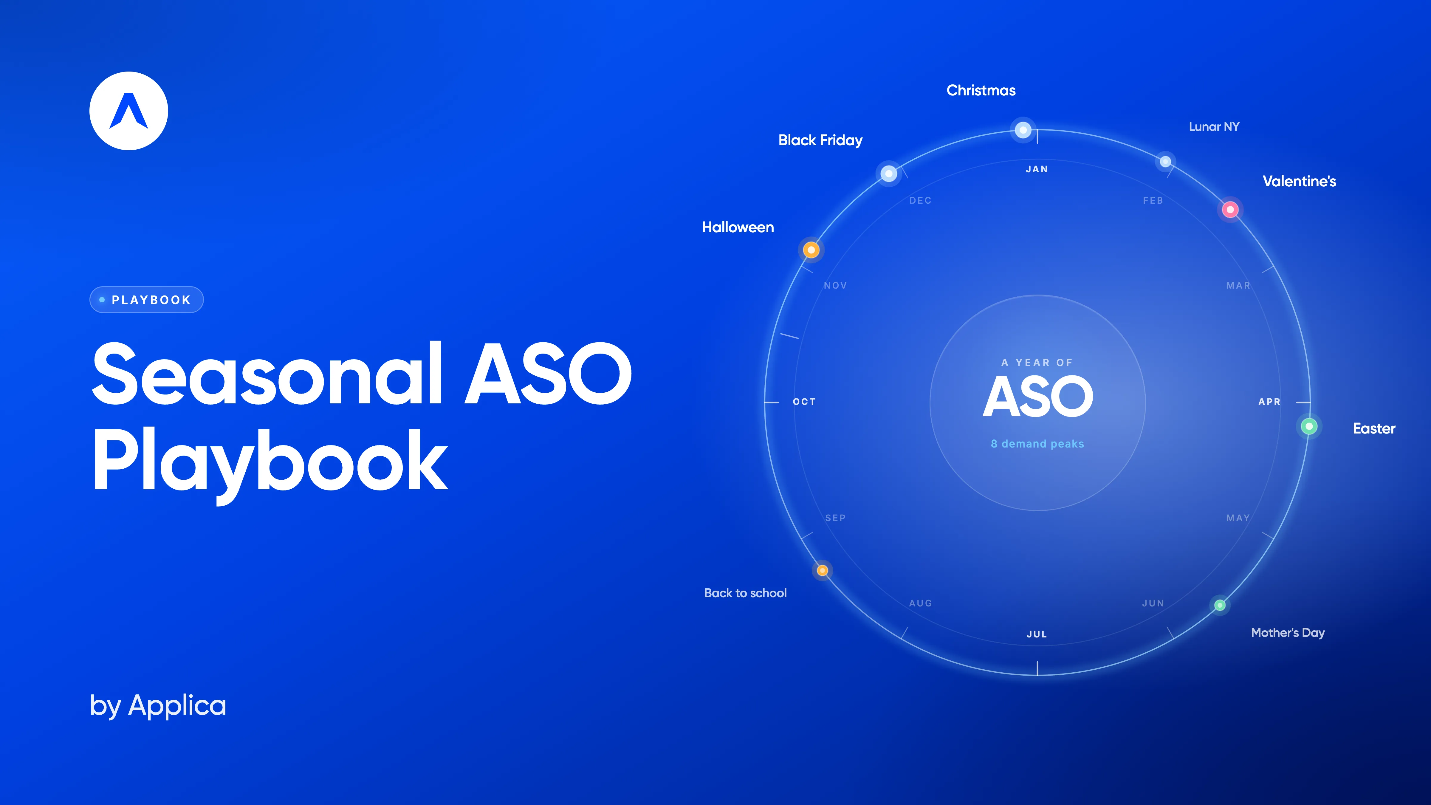
The Seasonal Calendar & Holiday Overview (and illustrated too)
Seasonal ASO works best when you plan ahead. Each holiday brings its own search trends, user behavior shifts, and promo opportunities, and knowing when these moments happen and having a visual seasonal calendar, helps you prepare creatives in advance, scale A/B tests, and align with paid UA campaigns.
Below is a simple global overview of the key seasonal moments and holidays covered in this playbook. While some dates vary by country, the general timing and preparation patterns remain consistent.
October: Halloween
Halloween, which is celebrated on October 31, consistently drives huge engagement in entertainment and creative categories: Games, Photo & Video, Lifestyle, and Entertainment.
Users expect bold, themed visuals.
What users search for:
- Halloween makeup
- Spooky games
- Horror filters
- Pumpkin stickers
- Halloween wallpapers
- Costume ideas
Apps that benefit most:
Photo/video editors, games, social apps, lifestyle
When to start preparing:
Early September. Halloween search trends build steadily throughout October and peak in the final week.
What to prioritize:
- Dark, bold icon variations
- Themed screenshots with contrasting colors for editing and creative apps
- Limited-time effects or filters
- Seasonal keywords (where relevant)
- Market-specific versions (Halloween is strongest in US, UK, CA, AU)
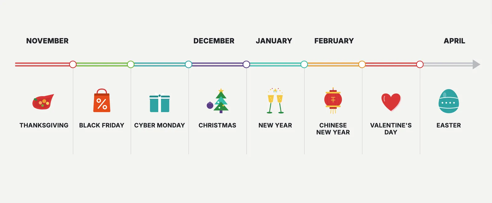
November: Thanksgiving and Black Friday
Even though they sit next to each other on the calendar, Thanksgiving and Black Friday are very different holidays, and from an ASO perspective too. One is about family, food and traditions. The other is one of the biggest shopping moments of the year. User intent, search patterns and conversion drivers don’t overlap, so your app store assets shouldn’t either.
Thanksgiving
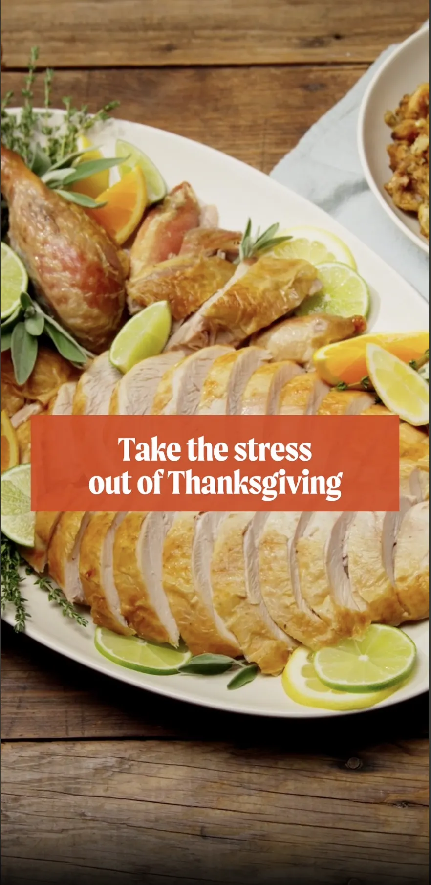
Thanksgiving is a planning-heavy holiday. In the United States, it’s celebrated on the fourth Thursday of November. For this holiday, people usually look for recipes, grocery lists, delivery options, family activities, movies and ways to entertain a house full of relatives.
Note: In Canada, Thanksgiving is celebrated on the second Monday of October. Although the holiday shares similarities across the two countries, there are some differences in history, timing, and traditions. In this Playbook, we’ll focus on US Thanksgiving.
What users search for:
- Thanksgiving recipes
- Turkey cooking guides
- Grocery delivery
- Family games
- Holiday movies / streaming services
Apps that benefit most:
Recipe / food apps, grocery and delivery apps, streaming services, family, education apps, event & activity guides.
When to start preparing:
Late October – early November. Update screenshots with family-oriented visuals, highlight helpful features, and consider small thematic touches (colors, warm seasonal tones). Food delivery apps can highlight traditional dishes.
Black Friday
Black Friday is a completely different story. Although it’s the Friday after Thanksgiving in the United States, unlike its family-oriented predecessor, this is the most commercial day of the year, and not only in the US – in many markets. Users are looking for deals, comparing different products and apps, and on the app stores, they’re very intent-driven and often search for specific apps, ready to download.
What users search for:
- Black Friday deals
- Cyber Monday
- Best discounts
- Price comparison terms
Apps that benefit most:
Shopping apps, retailer apps, deal aggregators, price-comparison apps, finance tools.
When to start preparing:
Early October. Search demand for “Black Friday” starts rising well before the event, so your tests and metadata updates need to happen earlier than most other holidays.
Tip: Some users are looking for good deals even after Black Friday has passed, so you leverage this opportunity and run Apple Ads when the bids are lower and the intent is still high.
What to prioritize:
- Clear deal-focused messaging in screenshots
- Custom product pages for specific categories
- Quick-hitting A/B tests for icons
- Strong alignment with paid campaigns
- Earlier submission (1-2 weeks before) to avoid review bottlenecks
Tip: Apple’s App Store guidelines state that screenshots must show the app in use and can include text and image overlays, but they must accurately reflect the app experience and not mislead users with unrelated promotional elements.
December & January: Christmas and New Year
Christmas (December 25) and New Year (January 1) form the biggest seasonal window of the year. User activity rises across almost every category, and expectations for festive visuals and relevant features are very high.
Christmas
Christmas is all about presents, creativity, entertainment, family and “home moments.” People search for apps that help them prepare, entertain, decorate, capture memories or buy gifts.
What users search for:
- Christmas games
- Gift ideas
- Holiday photo filters
- Christmas wallpapers
- Christmas recipes
- Delivery and last-minute shopping
- Christmas music
- Fireplace sounds
- Xmas sales
Apps that benefit most:
Games, lifestyle, photo & video, shopping apps, entertainment, apps for kids.
When to start preparing:
Early November. Christmas assets tend to run for several weeks, so early testing and localization pay off.
What to prioritize:
- Festive colors and icon accents
- Family, Christmas magic, or presents-oriented screenshots
- Seasonal custom product pages
- Localized messaging for different markets (Western vs. European vs. Latin American traditions)
New Year
New Year is more utility- and goal-oriented. Searches shift toward planning, budgeting, self-improvement and “fresh start” themes.
What users search for:
- Next year planner / calendar
- Budget apps
- Fitness goals
- Habit tracking
- New Year’s resolutions
- Wallpapers & quotes
Apps that benefit most:
Productivity, finance, fitness, wellness, journals, wallpapers, lifestyle.
When to start preparing:
Early-mid December. Many users start searching the moment mid-December hits and then spike from December 26 to January 2.
What to prioritize:
- “New Year, new goals” messaging
- Screenshots showing progress, streaks or habits
- Trend-aligned metadata (year-updated keywords)
- Versions localized for Western, APAC, and Middle Eastern markets (different New Year timings and behaviors)
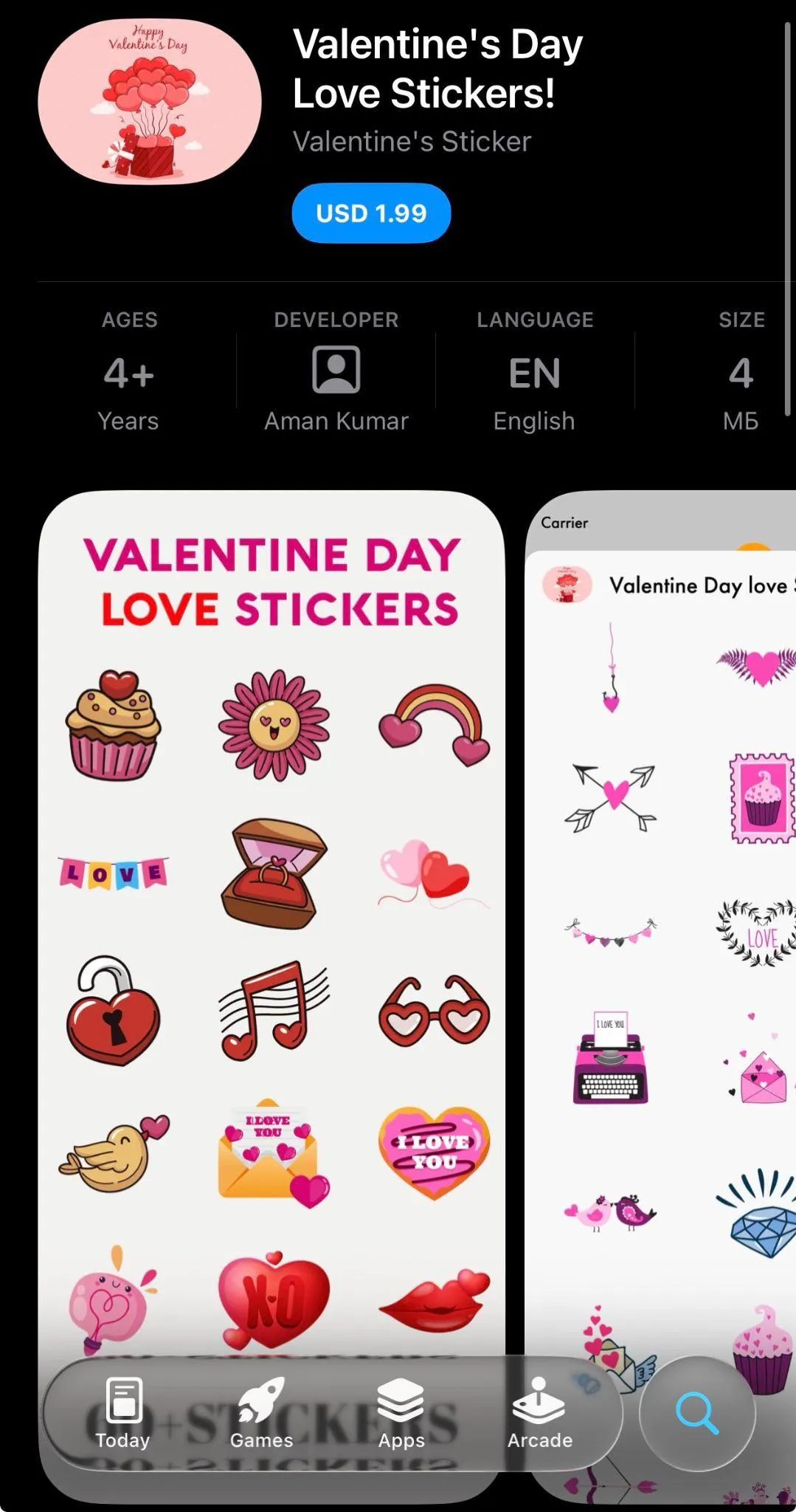
February 14: Valentine’s Day
Valentine’s Day celebrated on February 14 is short and intense. Users look for romantic, presents-related, and last-minute solutions, and app installs reflect that urgency.
What users search for:
- Valentine’s gifts
- Flower delivery
- Date ideas
- Romantic messages & stickers
- Photo filters for couples
- Presents ideas
- Restaurant reservations
Apps that benefit most:
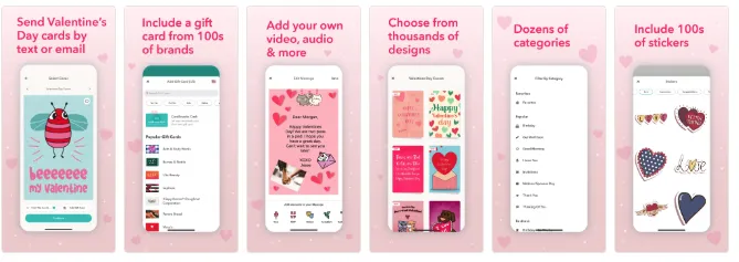
Dating, delivery, gifts & flowers, reservation apps, photo editors, greeting cards, social and lifestyle.
When to start preparing:
Late January – early February. Because it’s a short window, conversion-driving visuals matter more than deep metadata edits.
What to prioritize:
- Warm, romantic color accents
- “Same-day delivery” or “last-minute presents” messaging for shopping apps
- Localized versions (Valentine’s popularity varies by market)
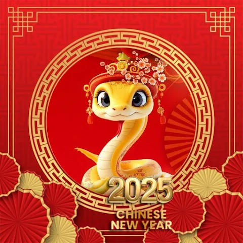
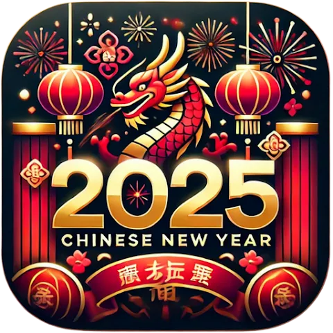
January / February: Chinese (Lunar) New Year
Chinese or Lunar New Year falls between late January and mid-February depending on the year. What’s notable, the celebration typically lasts for several days, a pretty long period, unlike in European countries and the US where it's usually only a one-day event. For example, in 2026, Chinese New Year will be celebrated on February 17 and up until March 3.
It is one of the most commercially and culturally significant holidays in Asia-Pacific, with strong expectations for festive red/gold visuals and region-specific symbolism.
What users search for:
- Lunar New Year
- Red envelope / hongbao
- Chinese wallpapers
- Zodiac year themes
- Festive stickers
- Shopping deals & travel
Apps that benefit most:
Shopping, finance, travel, games, social apps, entertainment, stickers/emojis.
When to start preparing:
4-6 weeks beforehand (late December – early January). Many apps run Chinese New Year visuals for the full period because celebrations extend across multiple days.
What to prioritize:
- Chinese New Year icon variants (red, gold, lanterns)
- Region-specific CPPs
- Localized metadata in Simplified Chinese, Traditional Chinese, Malay, Vietnamese, Indonesian
- In-app events aligned with the zodiac year. For example, 2026 will be the year of the Fire Horse.
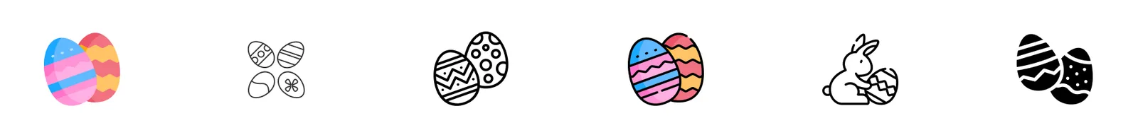
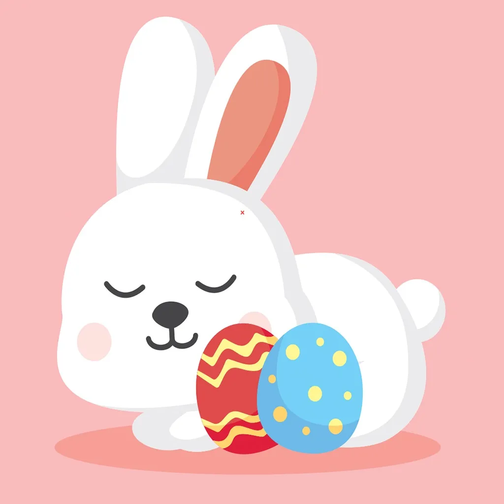
April: Easter
Easter typically falls between late March and mid-April. In 2026, it will be celebrated on April 5.
It’s a lighter but still meaningful seasonal moment, especially for family content and games.
What users search for:
- Easter games
- Egg hunt
- Spring wallpapers
- Easter crafts
- Easter recipes
- Family activities
Apps that benefit most:
Games (especially kids/family), lifestyle, photo editors, recipe apps, event & activity planners.
When to start preparing:
Early March. Easter visuals work best when they’re playful, bright and aligned with spring colors.
What to prioritize:
- Light pastel/spring themes
- Family-friendly visuals
- Seasonal sticker packs or frames
- Limited-time testing (Easter has a shorter window)
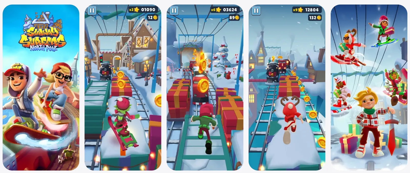
Halloween
Halloween isn't just about spooky vibes, it’s one of the most reliable moments of the year for mobile apps to boost downloads and revenue. It’s an opportunity you really don’t want to ignore. Consumers spend more and earlier as they prepare for the holiday, and mobile users follow the same behavior patterns inside the app stores. On top of that, the number of Halloween-related queries increases by 45% a few weeks prior to October 31st.
Halloween themes work well in terms of seasonal ASO in many markets, but they’re particularly effective in the US, Canada, Ireland, and Mexico, where the Halloween culture is stronger. The apps that typically benefit the most from updating their store listings for Halloween are Shopping, Games, Entertainment, Music, Lifestyle, and Photo & Video. They naturally align with all the spooky fun, but even if your app doesn’t fall into those categories, it doesn’t mean you should sit the season out. If your competitors aren’t doing anything Halloween-related, that might be your chance to stand out.
Below you’ll find some ideas on what you can test for your app store product page to capture Halloween-driven user intent.
Visual inspiration and themes
1. Color palette and atmosphere
- Classic Halloween colors: orange, black, red, purple
- Accent tones: blood red, pale yellow, deep violet for contrast
- Mood: Playful spooky, mysterious, cozy autumn, or fun-scary
Picture with color palette
2. Iconography and graphics
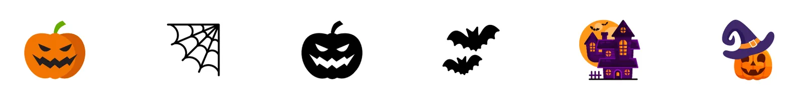
- Traditional elements: Pumpkins, bats, witches, black cats, spider webs, ghosts, zombies
- Some creative alternatives you can also test: Candies, autumn leaves, candlelight, jack-o’-lanterns
- Subtle overlays: Seasonal borders, shadows, small badges. In most cases, you don’t need to redesign the icon completely
https://www.flaticon.com/free-icons/halloween
3. Screenshot themes
Storytelling: Show users how your app fits into Halloween moments.
- Food & recipe apps: “Spooky Halloween treats in 3 steps”; “Order your pumpkin meal”
- Games: “Halloween special levels”, “Find and gather pumpkins”
- Photo& Video: “Transform your photos with spooky filters”
- Shopping: “Get your Halloween essentials fast”
Captions: Short, playful, thematic. For example, “Trick or Treat!”, “Get spooky!”, “Haunt your feed!”
Backgrounds: Use contrasting colors: orange, dark gradients, specific textures, such as webs, leaves, fog.
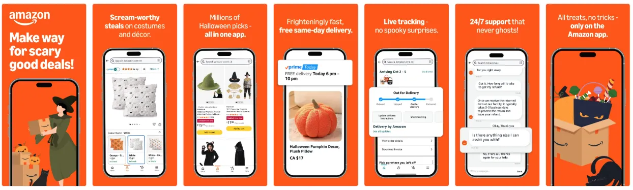
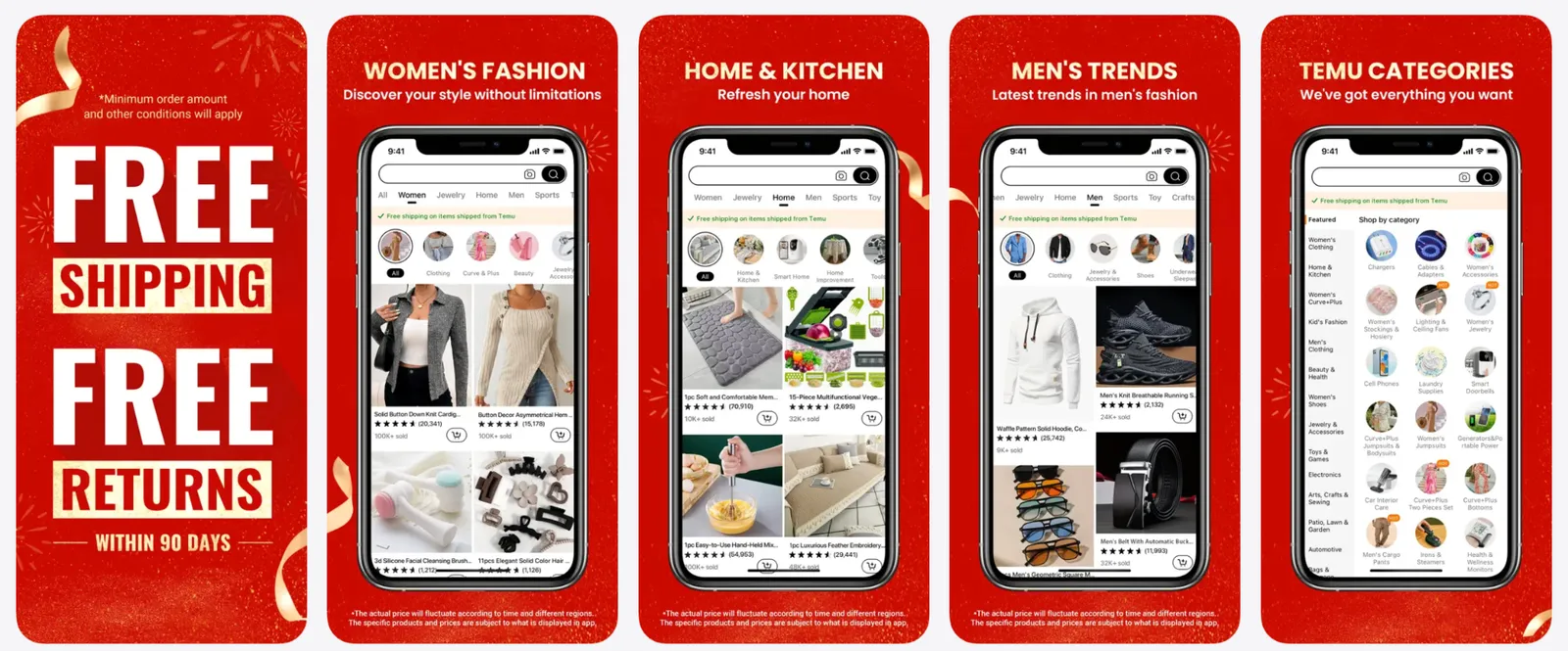
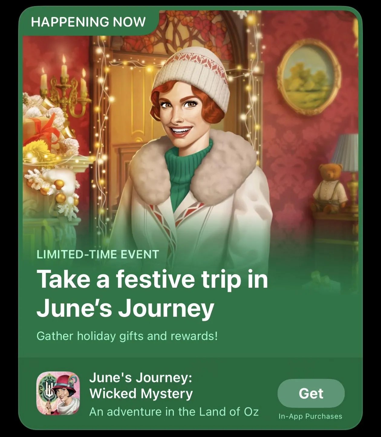
Amazon grabbed their Halloween opportunity and developed Halloween screenshots for a specific custom product page. They used attributes of the holiday: pumpkin, witch hats, black cats, all these on the orange background and with very spooky, on-point screenshot captions. It’s a great example of how an app can follow the trend, catch the moment, and stay completely up-to-date and at the same time fit all this into the context and core experience of the app itself.
4. Typography and messaging
Here is a small checklist to stick with when choosing fonts for your Halloween screenshots:
- Bold, readable fonts
- Fun fonts for playful entertainment apps
- Keep copy concise and seasonally relevant
Tip: Avoid clutter and too many elements on screenshots. Visuals should not overwhelm users.
5. Creative testing ideas
Like with anything in seasonal ASO, there’s no one-size-fits-all approach to Halloween. What works depends heavily on your app category, user expectations, and how far your brand can stretch visually. That’s why you should always A/B test before applying changes to your app store product page.
Here are several creative directions you can consider:
- Bold and spooky:
Dramatic contrasts, dark backgrounds, sharp Halloween motifs – great for apps in Games, Entertainment, and categories where strong seasonal visuals feel natural.
- Fun and playful:
Bright, cartoon-style graphics, friendly ghosts, candies, pumpkins – perfect for Lifestyle apps, photo editors, or anything with a lighter tone.
- Subtle and thematic:
Minimal seasonal accents like small overlays, frames, or color tweaks – ideal for evergreen brands or Utility apps that don’t want to drift too far from their core identity.
A/B test examples for Halloween
Here are some ideas for what to test to adjust your creatives to the Halloween vibes.
1. Icon variants
Icons are the first thing users notice. Seasonal tweaks can drive higher click-through, but which elements work best depends on your audience.
Examples of A/B tests:
- Pumpkin vs. Bat: Test whether a classic pumpkin (friendly, traditional) or a bat (spooky, bold) drives higher conversion.
- Full overlay vs. subtle accent: A full Halloween-themed icon versus a small seasonal badge or color accent. Sometimes just one tiny tweak does the trick.
- Color shifts: Dark orange background vs. standard brand color with Halloween elements.
Tip: Test one change at a time so you know what’s driving the lift.
2. Screenshots
Screenshots are the perfect place to showcase seasonal features or thematic content. A/B testing here can help determine which visuals and messaging convert best.
Examples of A/B tests:
- Seasonal content vs. evergreen content: Show Halloween-themed features (e.g., spooky filters, Halloween levels, themed recipes) vs. standard screenshots.
- Storytelling order: Test sequence of screenshots — start with “Halloween fun” first vs. ending with the Halloween feature.
- Captions and CTAs: “Get spooky!” vs. “Trick or Treat your photos!” or subtle seasonal messaging vs. neutral text.
- Background & color palette: Dark spooky backgrounds vs. bright playful tones to see which drives more installs.
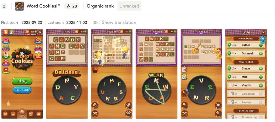
Word Cookies used a very subtle Halloween hint in their visuals: just a few pumpkins and a ghost. At the same time, the screenshot colors were perfectly aligned with the season, using yellow and black to evoke the holiday without overwhelming the user. It’s a great example of how minimal seasonal touches, combined with relevant color choices, can make your app feel timely and festive while keeping the core branding intact.
Tip: If your competitors are going heavy on bold colors and loud Halloween elements, that’s a signal worth testing against. In that case, try more vibrant or high-contrast screenshots as part of your A/B tests: you might find that matching (or outdoing) their visual intensity helps you stay competitive.
3. Additional testing ideas
- Preview video: Short clips with Halloween animations vs. standard app preview.
- Combination tests: Icon + first screenshot together: sometimes the lift only appears when both elements change.
- Custom product pages: Run seasonal CPPs targeting Halloween-specific search terms and compare conversion to your evergreen page. We’ll look at some CPP examples in the next section.
Custom product page concepts
Consider short-term CPPs to showcase Halloween collections, themed features, or promotions.
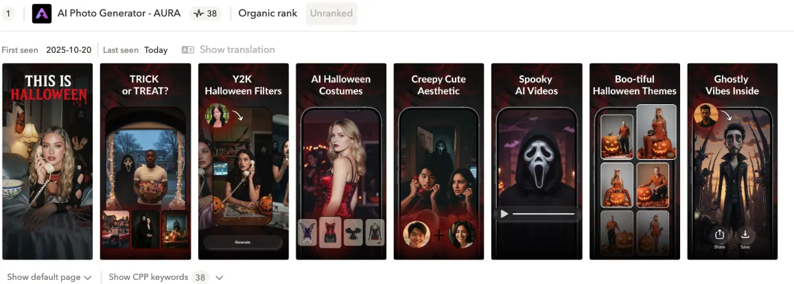
This app from the Photo & Video category really took the Halloween theme to the extreme with their seasonal CPP. The first screenshot opens with a bold “This is Halloween” headline partially in striking red, which grabs attention instantly. The rest of the screenshots stay fully on-theme, showcasing Halloween filters, costumes, video effects, and other festive tools the app offers. It’s a great example of leaning all the way into the holiday when your category supports it.
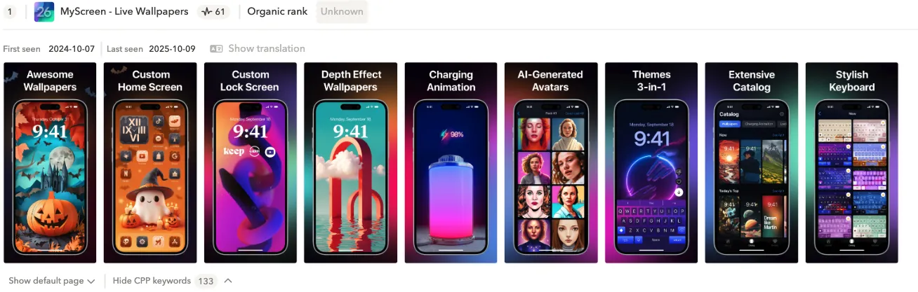
It almost feels like this wallpapers apps are made for holidays like Halloween, so creating a seasonal CPP isn’t just an option for them, it’s a must-have. This particular app leaned into all the trendy Halloween colors and added a few relevant elements to set the mood. Some screenshots are more generic, but a couple of the dedicated Halloween-themed visuals are strong enough to carry the seasonal message and make the page feel timely.
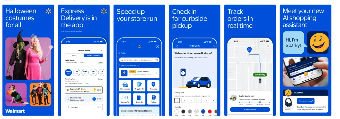
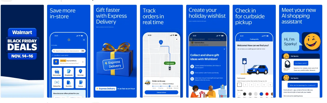
Another great example comes from a well-known American retail giant – Walmart. They dedicated only their first screenshot to Halloween, and honestly, that’s more than enough. Screenshot #1 is the most influential asset on your product page. It’s the one users see first, and often the only one they notice before deciding whether to tap and download. By making that first impression seasonal, Walmart captures the moment without needing to redesign the entire set.
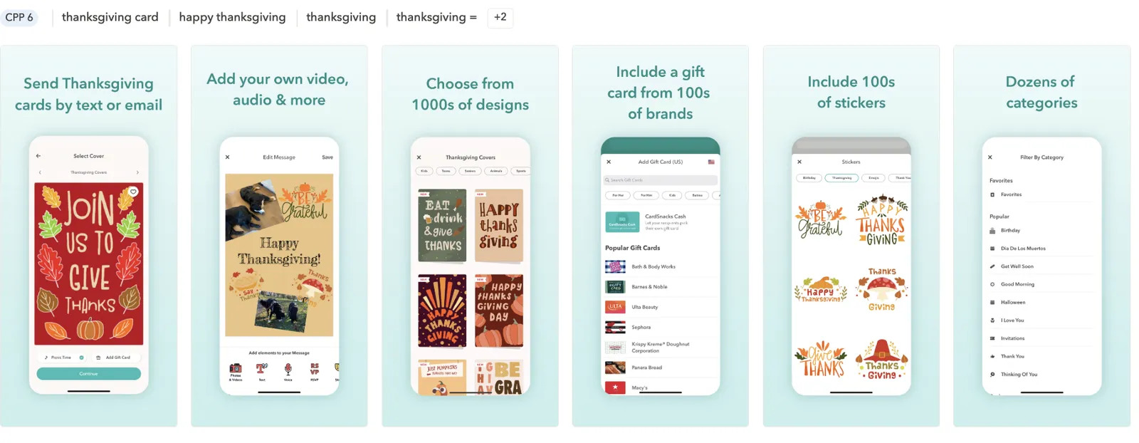
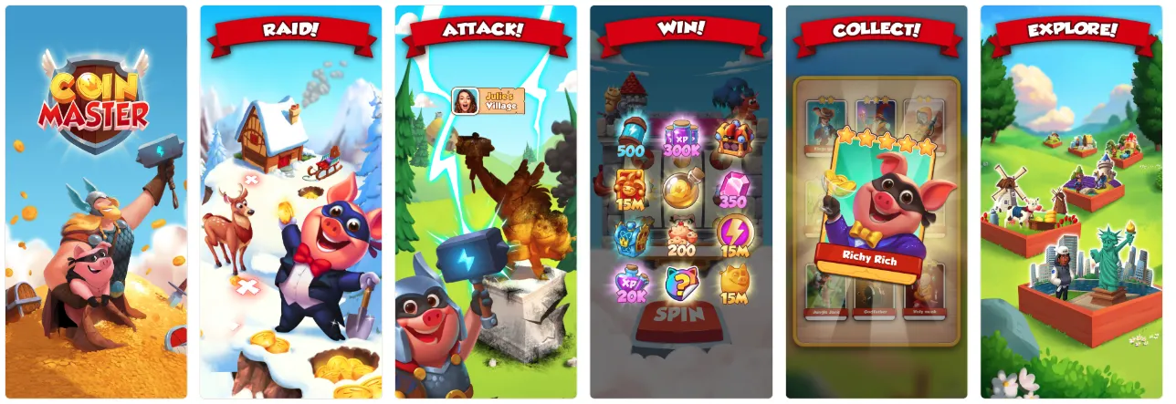
In-app event examples
Highlight in-app experiences that feel Halloween-ready. Let’s look at some in-app event examples below:
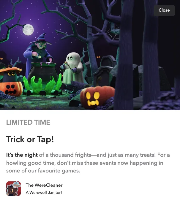
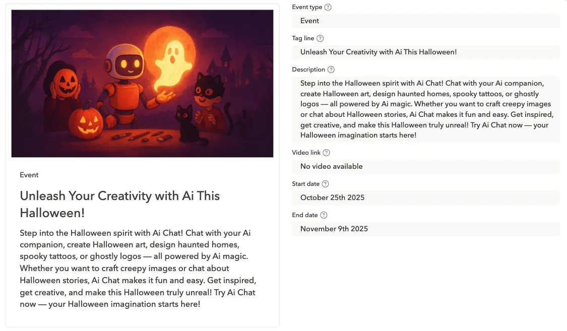
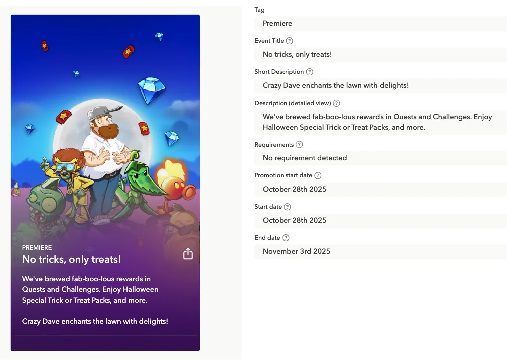
While the first two examples immediately grab attention with fully themed Halloween characters: pumpkins, witches, ghosts, in vivid, eye-catching colors, the third example takes a different approach. It focuses more on the copy, guiding users with the event title and description rather than relying solely on visuals. The first two include strong Halloween copy as well. But here mostly the messaging carries the seasonal context, directing users toward the Halloween experience.
Thanksgiving
Thanksgiving sits in an interesting spot on the seasonal ASO calendar. It’s not as visually loud as Halloween and not as globally universal as Christmas, but for the U.S. market, it’s a major moment. The visual language of Thanksgiving tends to be warmer, softer, and more tradition-focused. That means your seasonal creatives can be festive without being over the top.
Visual inspiration & themes
Thanksgiving visuals work best when they lean into warmth and familiarity. You don’t need heavy thematic graphics: subtle cues will do the work for you.
What to use:
- Warm oranges, browns, golds, cranberry reds
- Cozy kitchen or family table vibes
- Soft seasonal elements (leaves, warm lighting, subtle patterns)
- Clean, comforting typography (nothing too commercial)
How to apply it:
- Add warm accents to the app icon (a leaf, a soft gradient, subtle seasonal badge)
- Use seasonal frames or backgrounds in screenshots
- Showcase “togetherness” moments if relevant (family using the app, shared lists, group activities)
- Focus on helpful, calm messaging rather than urgency
1. Warm & cozy
A classic Thanksgiving look:
- warm oranges, deep reds, browns, gold
- candles, leaves, fall textures
- soft lighting and warm gradients
- cozy typography
Works best for: food apps, productivity, lifestyle, wellness, home-related apps.
This direction leans into the emotional side of the holiday: family gatherings, comfort food, and time at home.
2. Food-centered themes
Given the holiday’s roots, food visuals are instantly recognizable.
Consider testing:
- turkeys, pies, cranberries, fall harvest
- table settings, cooking tools
- recipe cards, meal planning highlights
Great for: food delivery, recipes, grocery, home organization, utilities.
If your app has even the slightest connection to food, this theme may work very well.
3. Fall aesthetics
For apps that prefer subtlety or can’t stretch too far away from brand identity:
- fall leaves
- minimal pumpkin accents (but not like with Halloween)
- autumn color overlays
- light seasonal borders or frames
Great for: finance, utilities, health, lifestyle, or any app with a more formal vibe.
You can choose and test this option if you don’t want to stray too far from your core brand identity. It adds a seasonal touch without making the visuals feel off-brand.
4. Gratitude & family messaging
Thanksgiving is also about appreciation and connection, so messaging can play a stronger role here.
Copy ideas for screenshots or captions:
“Plan your family holiday with ease”
“Everything you need for a stress-free Thanksgiving”
“Celebrate together”
“Your Thanksgiving preparation starts here”
Works well for: productivity, planning, travel, communication apps.
In this holiday, emotionally relevant copy can drive as much impact as visuals.
5. Clean modern look
Some brands avoid traditional Thanksgiving clichés and go for a more modern seasonal style:
- abstract autumn shapes
- geometric leaves
- muted earth-tone palettes
- minimalist icons or line art
Ideal for: premium brands, apps with strict design systems, shopping apps where product imagery needs to stay primary.
Icons, screenshots, and creative testing ideas for Thanksgiving
After defining the overall visual directions for Thanksgiving, here’s how you can translate those themes into actionable ASO assets.
Icon ideas for Thanksgiving
Subtle seasonal accent
- A small leaf or pumpkin in the corner
- A warm fall-colored stroke or border
- A soft gradient shift toward orange, gold, or deep red
Perfect when your brand can’t deviate much from its main icon.
Food-themed accent
Great for food delivery, recipe apps, grocery apps.
- Mini turkey silhouette
- Slice of pie
- Autumn harvest icon (corn, apples, squash)
Cozy and warm variant
- Swap cool blues or greens for warm orange-brown tones
- Add soft shadows or fall textures
- Incorporate a candle-glow gradient for a “holiday warmth” feel
Testable icon variants
- Pumpkin vs. leaf
- Warm palette vs. brand palette
- Subtle accent vs. medium accent vs. fully themed icon
Tip: Thanksgiving icons usually don’t go as extreme as Halloween, but even small shifts can lift CTR in the US market.
Screenshot сoncepts for Thanksgiving
Screenshots are where Thanksgiving visuals can shine more clearly than in the icon. These directions keep the tone festive, warm, and relevant.
Warm and cozy storytelling
- Fall color palette
- Soft lighting
- Table settings, wooden textures, candlelight accents
Screenshot CTA examples:
- “Plan the perfect holiday”
- “Your Thanksgiving starts here”
- “Make the most of the long weekend”
Food and gathering-focused Screenshots
For food-related apps, this can drive strong conversion.
- Show Thanksgiving recipes
- Highlight holiday meal planning, shopping lists
- Use visuals of dishes, grocery items, or cooking tools
Fall-only design
For utilities, finance, or productivity apps:
- Light leaf decoration
- Soft fall gradient backgrounds
- Minimal overlays, not too theme-heavy
Travel, communication and planning angles
Thanksgiving is the busiest travel week in the US, so you can address this in messaging.
- “Stay connected with family”
- “Plan your holiday trip with ease”
- “Beat the holiday rush”
Copy-driven approach
Since Thanksgiving isn’t visually loud, strong text can guide the message:
- “Get holiday-ready”
- “Organize your Thanksgiving weekend”
- “Your Thanksgiving essentials in one place”
A/B testing ideas for Thanksgiving
A/B testing is crucial, especially for a more subtle holiday like Thanksgiving. Here are structured test ideas you can use:
Icon tests
- Subtle accent vs. bolder accent
- Leaf vs. pumpkin
- Warm palette vs. original palette
- Seasonal icon vs. evergreen icon
Tip*:* Thanksgiving icons often benefit from the “warm palette” test.
First screenshot tests
Since screenshot #1 drives most conversion, try:
- Fall-inspired background vs. evergreen background
- Copy-first vs. visuals-first approach
- Cozy theme vs. modern minimal
- Thanksgiving CTA (“Get ready for Thanksfgiving”) vs. neutral CTA
Seasonal feature showcasing
If your app includes Thanksgiving-relevant features:
- Test highlighting them in screen #1 or #2
- Compare benefit-focused vs. feature-focused layouts
- Show feature screenshot vs. lifestyle/product imagery
Keyword and metadata opportunities
Thanksgiving keywords center around planning and food. Add them only if they naturally fit your app: users can smell keyword stuffing a mile away.
Examples of relevant keyword themes:
- Recipes: “Thanksgiving recipes,” “turkey recipe,” “holiday meals”
- Planning: “meal planner,” “shopping list,” “grocery delivery”
- Family & activities: “family games,” “kids activities,” “holiday movies”
- Hosting: “party ideas,” “table decor,” “holiday planner”
Tips:
- Use Thanksgiving keywords in your long description and promotional text rather than forcing them into titles and subtitles.
- Update metadata 2-3 weeks before Thanksgiving – early enough to index before the spike.
- If your app has strong evergreen positioning, keep it and weave Thanksgiving terms around value rather than replacing your core message.
Product page localization for Thanksgiving
Because Thanksgiving is strongest in the US and Canada, it doesn’t carry meaning in most other markets, so keep seasonal messaging localized, not global.
Things to consider:
- The default page (if different from the US) stays evergreen; US & CA versions get Thanksgiving visuals.
- US and Canada may use slightly different vocabulary (e.g., “stuffing” vs. “dressing,” “holiday dinner” vs. “festive meal”).
- Screenshots can use cultural cues (food, table settings, fall scenery) without being overly themed.
- Make sure date formats, recipe units, and cultural references match the market.
Custom product page tests
If you’re using custom product pages (which we highly recommend), Thanksgiving-specific CPPs can support:
- Recipe bundles
- Grocery/delivery promos
- Family activities
- Home organization or event planning
Try comparing the performance of the following CPP variations:
- One CPP with strong Thanksgiving visuals
- One with subtle fall-themed visuals
- One evergreen CPP as a control
Compare performance across paid UA channels, especially during the 10-14 days before Thanksgiving.
In-app event examples for Thanksgiving
In-app events dedicated to Thanksgiving tend to work especially well for food delivery and recipe apps. It’s a natural fit with user intent: people are planning meals, searching for inspiration, and looking for convenient ways to handle holiday cooking, so timely events can drive strong engagement and consequently, downloads.
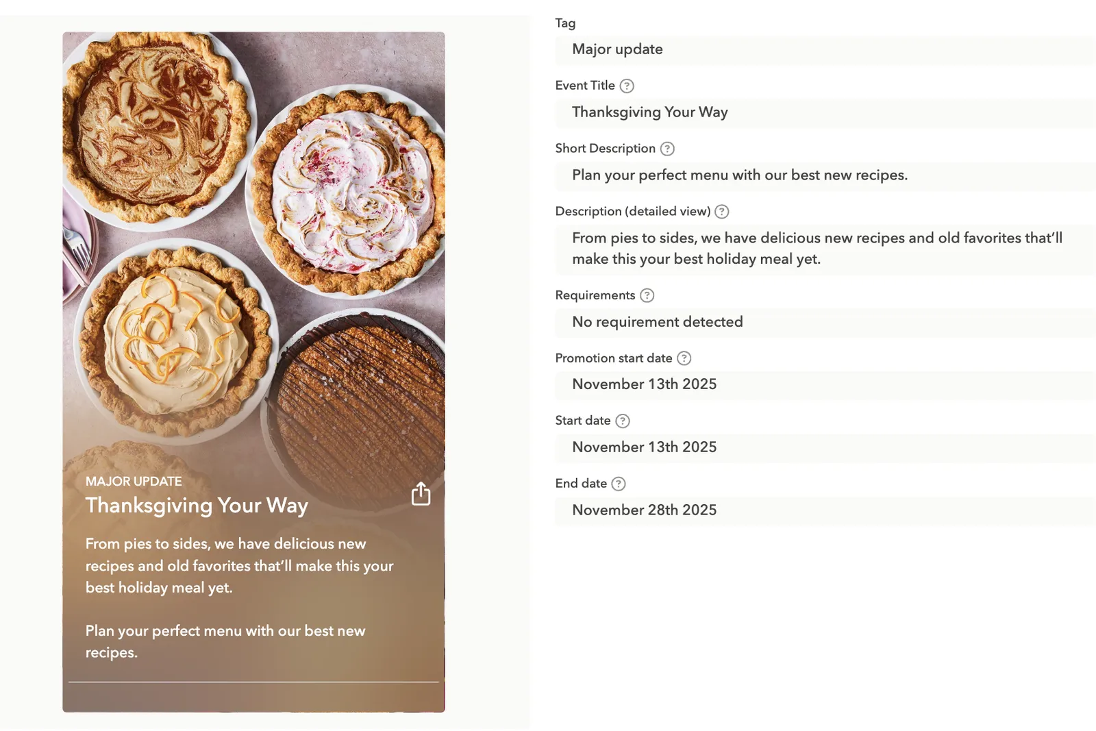
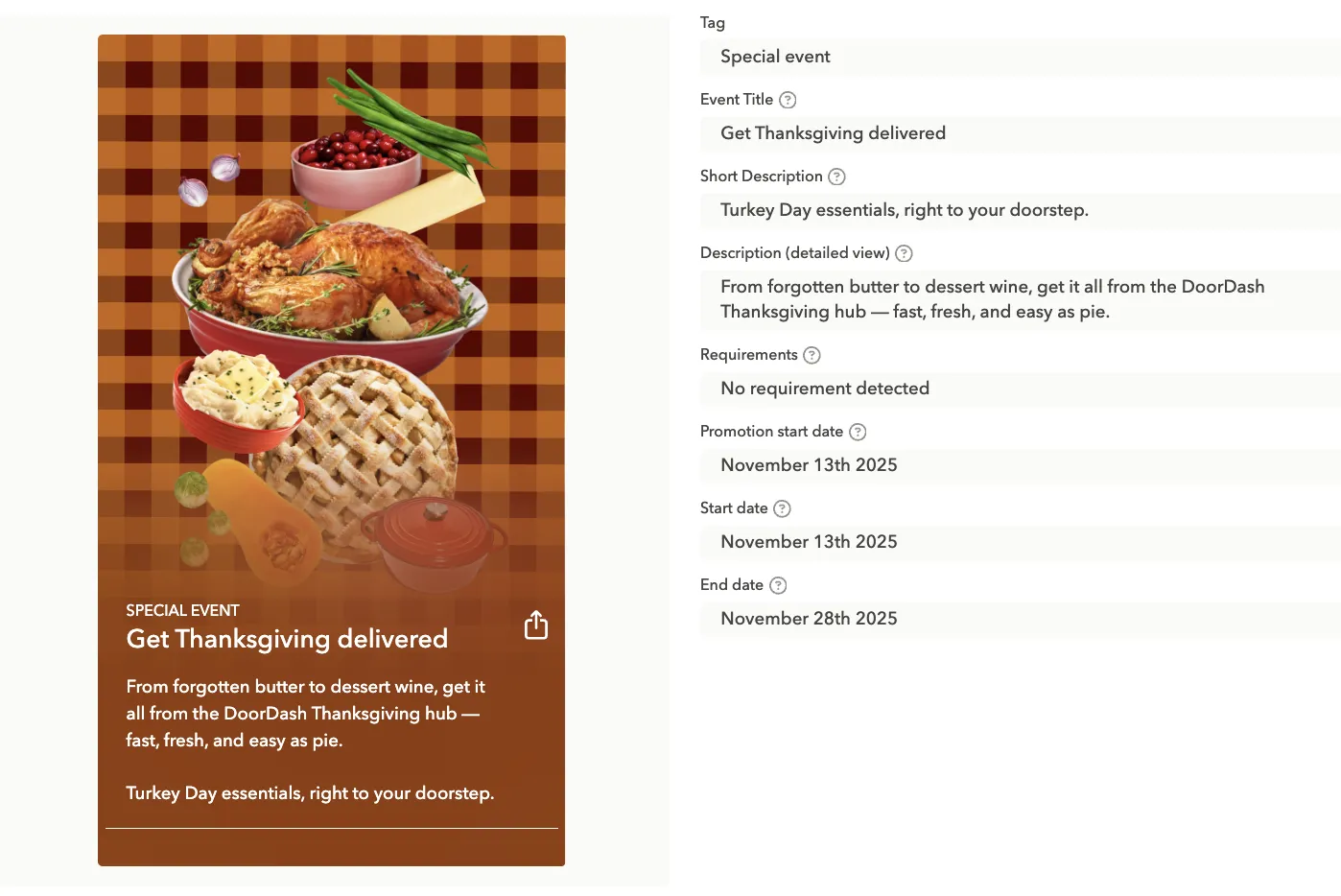
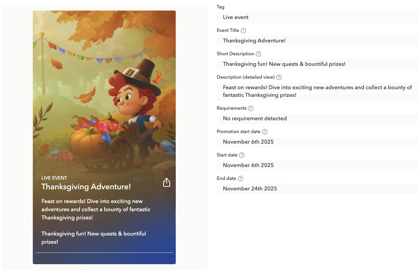
For certain gaming subgenres, it also makes a lot of sense to run Thanksgiving-themed in-app events. In the example below, the game encourages players to jump in, complete new quests, and collect rewards.

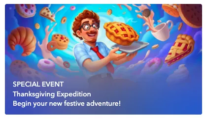
And here is also a game, but with a completely different approach, with food elements featured.
Black Friday
Black Friday is one of the most competitive commercial moments of the year. Users actively look for deals, savings, limited-time offers, and apps that make their shopping easier. Visually, the theme is bold, contrast-heavy, and urgency-driven. Your CPP and store creatives should reflect that intensity while remaining clean, modern, and consistent with your brand identity.
Black Friday visual themes
Black Friday visuals are all about urgency, value, and clarity. The creative approach should be bold and focused on conversion.
- High contrast palettes: Black, dark gray, pure white
- Accent colors: Yellow, neon green, red, used sparingly
- “Deal energy”: Lightning, glow, shine, sparkles, contrast blocks
- Minimal but bold: Big typography, simple shapes, strong gradients
- Luxury sale vibe: Matte black backgrounds + metallic gold accents (popular across verticals)
Black Friday icon ideas
Note: Apple does not allow text, discount percentages, or promotional claims (e.g., “50% OFF,” “Sale,” “Black Friday”) in app icons.
So, you must communicate the Black Friday theme purely visually.
Ideas:
- Darkened / blacked-out version of your regular icon
The most popular and safest approach.
- Accent color glow or outline
Example: yellow glow around your logo symbol.
- Metallic or glossy effect
Subtle, modern, conveys “premium sale.”
- Limited-time palette shift
E.g., brand blue → black background + neon blue element.
- Minimal holiday detail
A thin ribbon, sparkle or subtle gradient (non-promotional).
Tip*:* Avoid completely redesigning the brand icon: small seasonal tweaks are usually enough.
Screenshot concepts for Black Friday
Screenshots are where you can fully communicate the Black Friday offer: this is the surface where promo text is allowed.
Ideas:
- Deals and discounts: Show top products, promo banners, or limited-time offers.
- Highlighting features along with benefits: Highlight how the app makes deal-hunting easier (price comparison, wishlist, alerts).
- Urgency messaging: Use the copy like “Ends soon,” “Don’t miss out.”
- CTA-focused screenshots: Guide users to act fast with clear, bold buttons or highlighted actions.
Copy examples:
- “Get the best deals before they disappear”
- “Your Black Friday shopping companion”
- “Track prices, save money, shop faster”
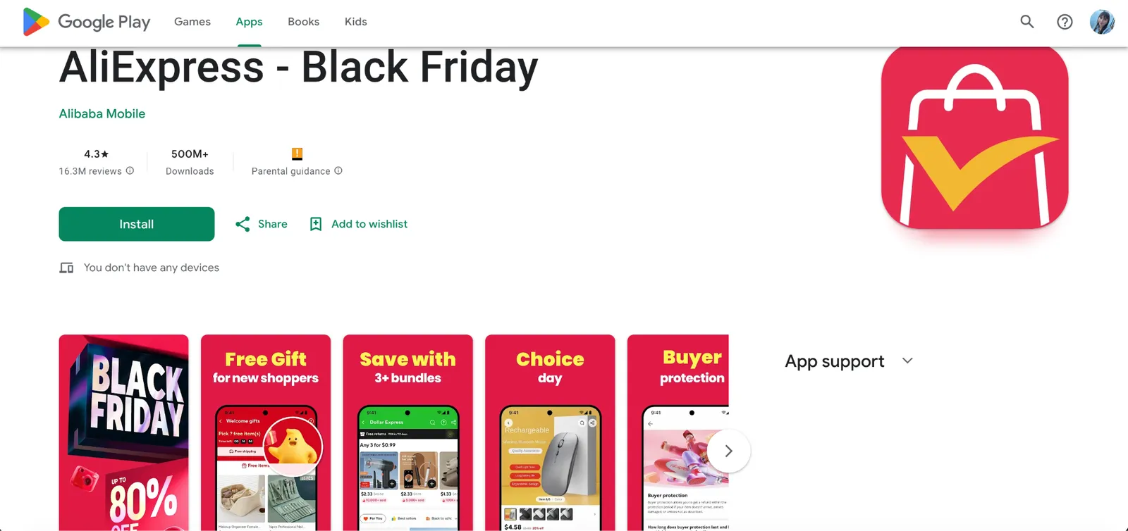
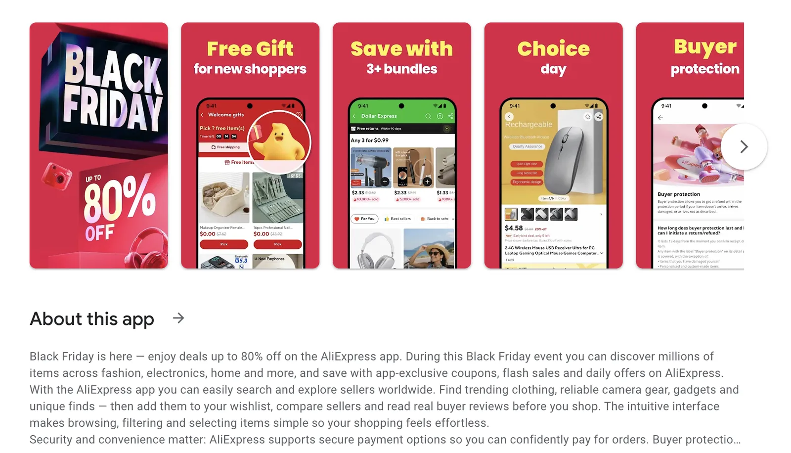
AliExpress added Black Friday to the app’s name on Google Play. Straightforward Caption on the first screenshots promises discounts up to 80% off, while others induce new shoppers with free gifts, bundles
AliExpress went all-in for the season and even added “Black Friday” to the app name on Google Play. The first screenshot delivers a clear promise with a bold “up to 80% OFF” caption, while the following ones reinforce the message with free gifts and bundles to convert both new shoppers and loyal customers.
Creative testing ideas for Black Friday
1. Icon tests
- Original icon vs. seasonal accent
- Dark vs. light backgrounds
- Sale badge vs. no badge
2. Screenshot tests
Bold deal messaging vs. feature-focused screenshots
CTA copy variations: “Shop Now” vs. “Grab Deals”
Product-focused vs. benefit-focused imagery
First screenshot urgency vs. last screenshot urgency
3. CPP & metadata tests
- Test a seasonal custom product page vs. evergreen page
- Keywords: “Black Friday,” “Deals,” “Discounts”
- Seasonal subtitles: “Your Black Friday hub” vs. evergreen subtitle
4. Video and preview tests
- Short promo videos highlighting top deals
- Time-limited messaging in video overlays
- Compare impact of static vs. animated visuals
Tips and best practices
- Start planning and testing at least 4-6 weeks before Black Friday.
- Keep visuals bold, and clear.
- Highlight urgency and value: users are actively looking for deals.
Tip: Showcase big discounts in the first screenshot.
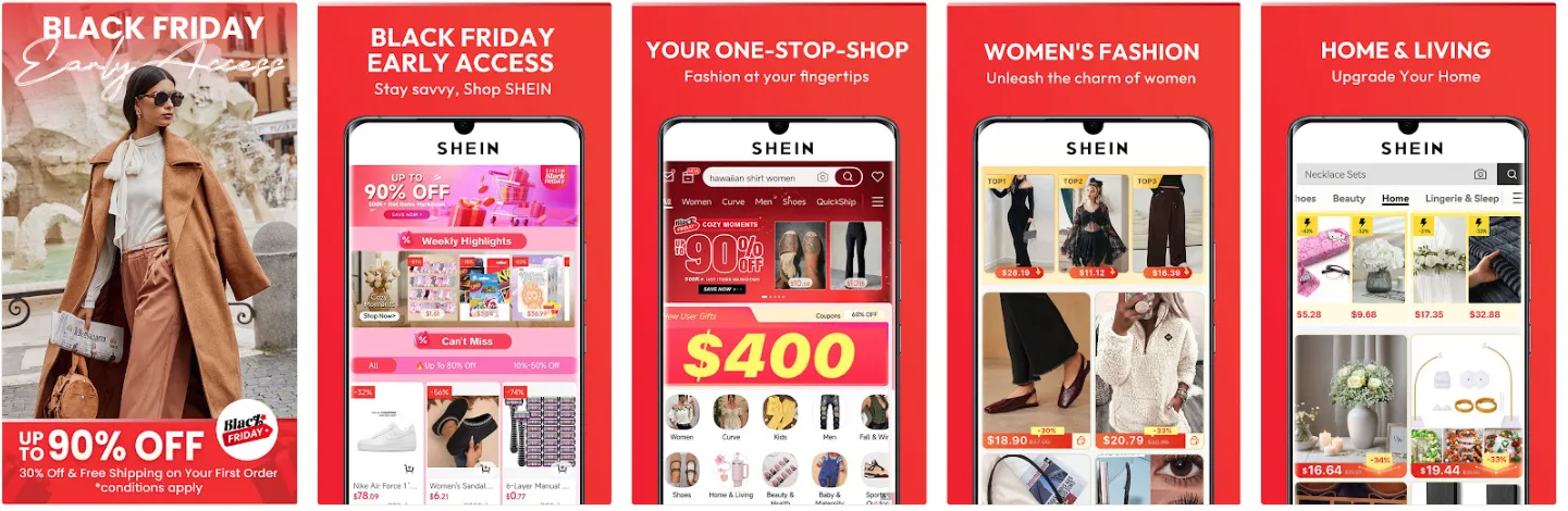
Shein is a great example of an app that didn’t hesitate to go all-in on Black Friday, while showcasing the value for customers. Their first screenshot features a bold, unmistakable “Black Friday” headline, followed by an even louder claim of discounts up to 90%. The message is instant, clear, and tailored to the moment. By dedicating just the first two screenshots to the event, they set the tone for the entire listing without having to overhaul the rest of the set. Sometimes, leading with a strong seasonal hook is enough to do the heavy lifting.
- Even if your app isn’t strictly a shopping app, consider seasonal promotions or gamified deals to capture attention.
- Monitor competitors: if they’re using bold colors or sales messaging, you can use it to A/B test your own app store product page visuals.
- It’s not always about creatives solely: try tweaking your title for the period before, during, and after Black Friday. And once the peak is over, you can roll back to your evergreen version.
Samsung and Netshoes also leaned into the moment by adjusting their titles for the season – and thus captured trending searches.
Examples of custom product pages for Black Friday
Walmart went a step further and built a dedicated Black Friday custom product page. The first screenshot immediately stands out: a deeper, darker blue than their usual brand shade, paired with a bold, high-contrast caption in a large font. Some of the following screenshots subtly reference the broader holiday period.
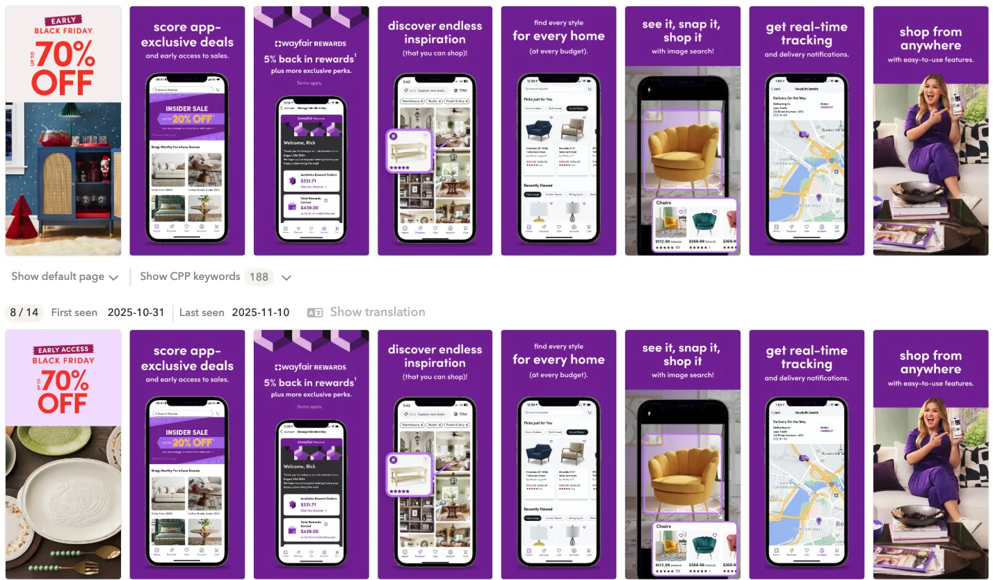
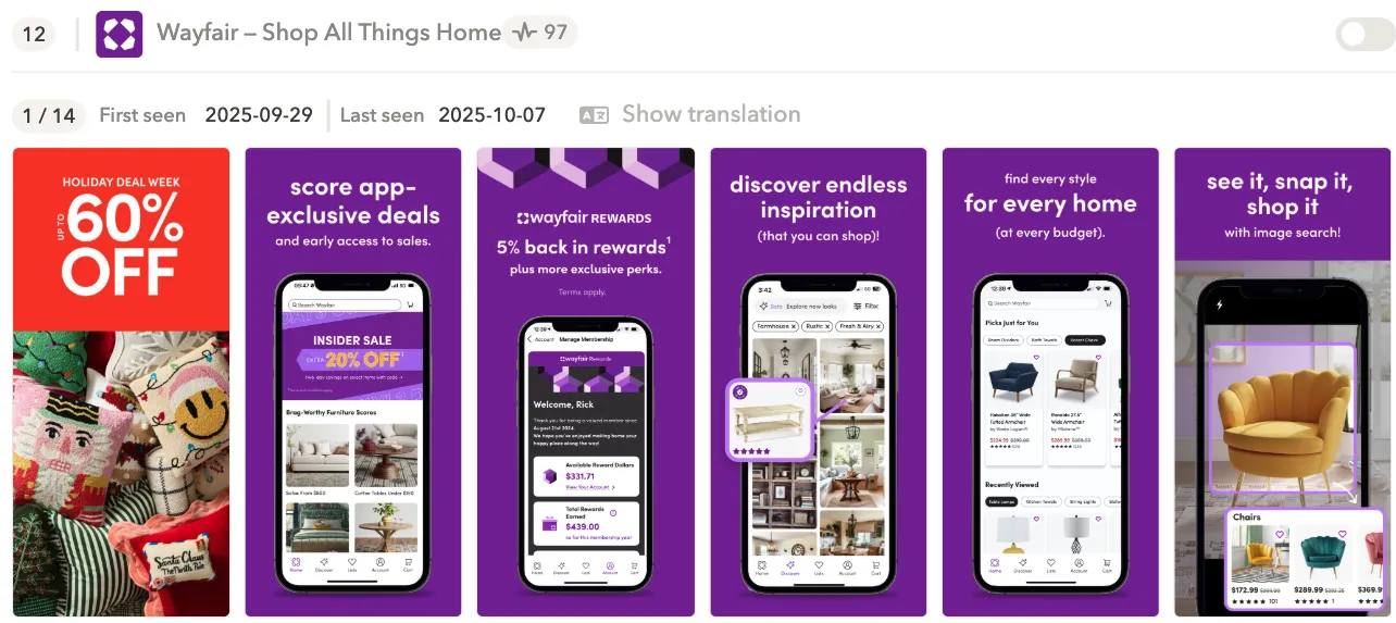
Here’s a great example of two Black Friday CPP variations Wayfair tested. The only difference is in screenshot #1, and that’s exactly where it matters most. Both variations follow the best practices we’ve covered: a bold discount message, high contrast, and an eye-catching, vibrant color that instantly signals a limited-time offer. It’s a simple tweak, but one that can have a huge impact on conversion during Black Friday.
Examples of in-app events for Black Friday
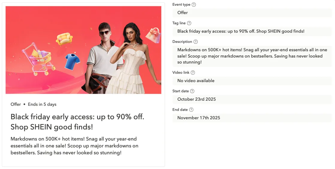
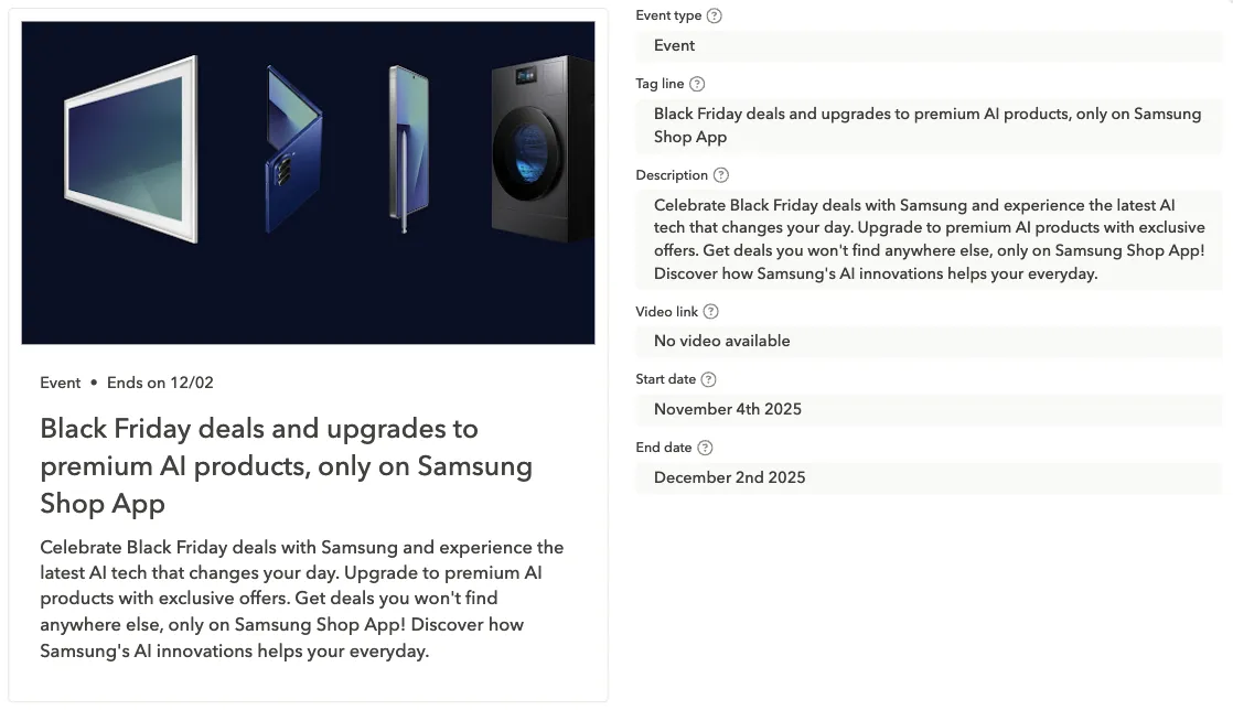
Shein used their Black Friday in-app event to double down on what their audience cares about most: deep discounts on trending items. Meanwhile, Samsung took a different angle, using the event to spotlight their newest AI-powered products. Two very different approaches, but both smart: one leans into price-driven demand, the other leverages increased traffic to push high-value product lines.
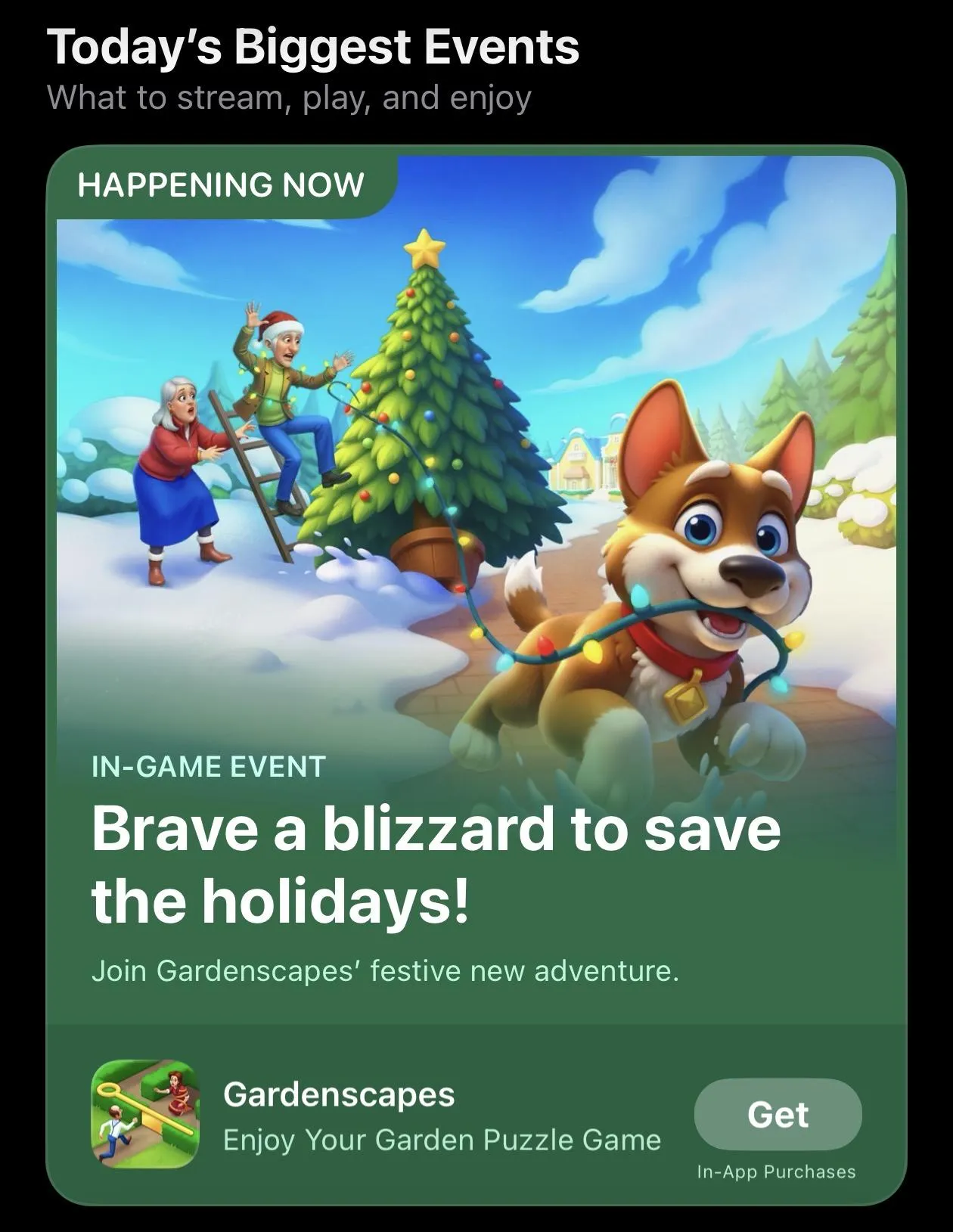
Christmas
Christmas is the peak holiday season for most categories, not only in terms of downloads, but also user intent. Between mid-December and the last week of the year, people spend more time on their smartphones, shop more, buy more presents, and explore more apps. This is the season where even small tweaks can deliver meaningful results for your mobile app.
Users prepare for Christmas early, gifting spikes, and many apps experience a natural surge simply due to increased device activity, which makes your adjusted app store creatives a must have for this period.
Below is a breakdown of how to approach Christmas from an ASO perspective.
Visual inspiration and themes for Christmas
Christmas aesthetics are instantly recognizable, which is exactly why they work so well.
Common visual motifs
- Snowflakes, snow, frosted textures
- Christmas trees, ornaments, decorations
- Santa hats (used for icons)
- Gift boxes, ribbons, sparkles
- Stars, lights, gold accents
- Cozy and warm designs: red, green, gold, soft light effects
Color palettes
- Classic red + green
- Elegant gold + white
- Cozy warm tones (cream, cocoa, soft orange)
- Winter cool tones (blue, silver, icy textures)
Add picture with a color palette
Style options you can test
Bold and festive: Bright colors, strong contrasts, heavy Christmas motifs.
Warm and cozy: Soft, welcoming colors and subtle seasonality: great for lifestyle, photo, wellness apps.
Minimalistic and premium: Subtle accents: snowflakes, gold lines.
https://www.flaticon.com/free-icons/christmas
Christmas icons
Things that work well for Christmas icons and are definitely worth testing:
- A Santa hat or subtle ornament added to a corner of the icon
- A snowflake or small sparkle integrated into the existing brand mark
- Switching to a holiday-themed color set (red, green, gold, icy blue)
- A soft glow or light effect behind the main icon element
- Snow or frost texture on the edges
Icons examples:
https://play.google.com/store/apps/details?id=com.novapontocom.casasbahia&hl=en
Casas Bahia is one of the biggest shopping apps in Brazil.
https://play.google.com/store/apps/details?id=pl.allegro&hl=en
Tip: Avoid overcrowding the icon and using text such as “Sale,” “Xmas.”
If your brand is more conservative, testing a light seasonal accent is often enough.
Christmas screenshots
Christmas screenshots are where you can lean harder into the theme especially if your users expect a festive experience.
Effective Christmas screenshot elements
- Redesigned captions with festive colors
- Snowy overlays or light sparkle textures
- Visuals showing holiday features (e.g., Christmas filters, seasonal items, holiday playlists)
- Gift-related storytelling (“Find presents fast,” “Last-minute deals,” “Holiday photo effects”)
- Decorative frames around device mockups
- A strong Christmas hook in screenshot #1
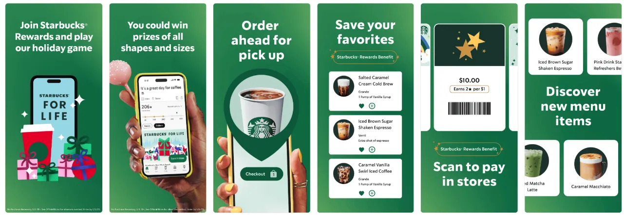
Starbucks naturally wove Christmas elements into their existing branding and visual style.
Screenshot caption ideas
- “Holiday deals are here”
- “Make your photos festive”
- “Find the perfect gift”
- “Plan your Christmas week”
- “Special holiday updates inside”
Tip: Even though Christmas isn’t as discount-centric as Black Friday, some Shopping apps still run strong holiday sales. If your app falls into this category, highlighting seasonal offers in your screenshots or CPPs can work just as well during Christmas as it does during Black Friday.
Custom product pages for Christmas
Christmas is one of the strongest moments for CPPs:
- Acquisition teams can create holiday-focused ad funnels
- You can tailor messaging by country (e.g., Christmas vs New Year focus)
- Creative teams can align CPPs with broader holiday campaigns
- Seasonal features (filters, gift options, playlists) can be showcased separately
A Christmas custom product page, or, at least, its first screenshot, should ideally look different from the main listing: more festive and more promotional.
Above are two great examples of custom product pages where the apps went fully seasonal in screenshot #1, even though the design doesn’t follow their usual brand aesthetic. The first screenshot’s job is to grab attention at the right moment, and a bold, Christmas-focused visual does exactly that. The remaining screenshots return to the app’s familiar, on-brand style, giving users both the seasonal hook and the brand clarity they need to make a confident download decision.
What you can test in terms of CPPs:
- Gift-focused version
- Deal / holiday shopping version
- Feature-focused seasonal version
Creative testing ideas for Christmas
Of course, there is no silver bullet, and there are multiple factors, including your app category, target audience, and key markets. But here you’ll find some ideas of what you can A/B test for Christmas:
Icons
- Red theme vs icy blue theme
- Santa hat vs snowflake
- Subtle holiday accent vs full festive redesign
Screenshot #1 variations
- “Holiday Deals” theme vs “Christmas Gifts” theme
- Red background vs gold vs winter blue
- Photo of a holiday feature vs pure festive motif
Some tricks that depending on app categories:
- Shopping: gifts, holiday deals, seasonal promotions
- Photo & Video: Christmas filters, cards, templates
- Entertainment: holiday movies, shows, playlists
- Games: in-game events, holiday skins & rewards
- Lifestyle: Christmas recipes, planners, reminders
- Finance: budgeting, holiday spending tracking
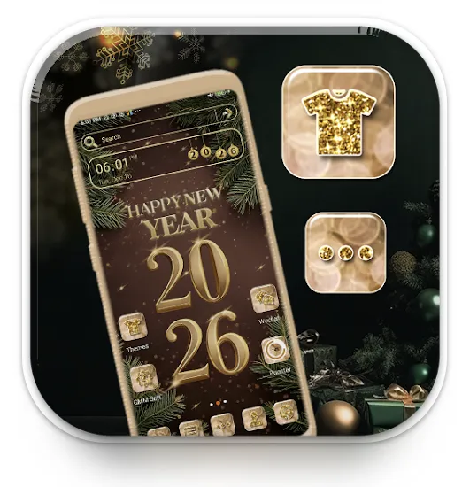
New Year
Although New Year does not generate the same level of emotional engagement as Christmas, it produces a conversion uplift for certain verticals: Shopping, Health & Fitness, Finance, Productivity, and others.
Visual cues for renewal and motivation
New Year visuals are less about “festive cozy holiday vibes” and more about renewal, motivation, and celebration.
Themes that work well:
- Fireworks (subtle or bold)
- Calendars, planners, checklists
- Clocks striking midnight
- Sparkles, glitter, golden gradients
- “Fresh start” or “New beginning” feel
- The year itself (2026)
https://www.flaticon.com/free-icons/new-year
Color palette ideas
- Black + gold
- Deep blue + silver
- White + gold
- Bright neon gradients
New Year icons
New Year is less “emotional” and festive than Christmas, but still a strong seasonal trigger because it’s tied to fresh starts, motivation, planning, and self-improvement. If your app fits productivity, fitness, finance, lifestyle, or wellness, updating your icon can support higher intent and relevance.
What usually works well:
- Subtle seasonal overlays rather than loud redesigns
Think fireworks spark, small confetti touches, clock elements, sparkly outline, or some typical color accents.
- Symbolism of renewal and progress
Calendars, checkmarks, progress bars, fitness silhouettes, or goal-oriented shapes.
- Color accents
Gold, silver, deep blue, and celebratory gradients tend to perform better than “cartoon-holiday” aesthetics.
- Minimal disruptions to core brand identity
Keep recognizability. Test seasonal flair, not a completely new brand look.
New Year icon testing:
- Subtle vs. bold updates
- Test “celebration” feel vs. motivation & goals
- Plan to switch back quickly: New Year relevance drops fast early January
New Year screenshots
New Year screenshots usually perform best when they connect celebration and purpose. Users aren’t just festive, they’re actively looking to fix, improve, or organize life.
Strong creative directions:
- “New Year, New Goals” positioning
Works great for productivity, fitness, learning, finance, health, and self-improvement apps. Show progress, achievements, routines, and transformation.
- Celebration framing, but within your app context
Fireworks, confetti bursts, countdown clocks, city skyline celebrations, “2026 is your year” style messaging, as long as it still clearly communicates the app value.
- Motivation-driven copy (but grounded in features)
Instead of generic hype, anchor your captions in real benefits:
- “Start your 2026 fitness journey”
- “Plan your best year yet”
- “Track your goals. Stay consistent.”
- “Save smarter this year”
- Localization matters
Note that In some regions, New Year is a bigger trigger than Christmas, so tailor tone and visuals where relevant.
If Christmas is all about mood and emotion, New Year is about momentum and intent, and your icons and screenshots should reflect exactly that.
Keywords opportunities (Resolution intent)
Search data typically shows resolution-driven queries spike 2-4x in the first 10 days of January. These are high-conversion, mid-competition keywords ideal for seasonal bursts.
High-intent keyword clusters:
Motivation / Personal Growth
- new year resolution app
- make habits / habit tracker
- start new routine
- daily goals / personal goal


Fitness
- start working out
- beginner fitness plan
- lose weight new year
Productivity
- plan new year
- 2026 planner
- calendar goals
- organize my life
Finance
- new year budget
- start saving
- expense tracker 2026
Tip: If you don’t want to change your metadata, you can use these keywords for custom product pages + Apple Ads for maximum impact without risking ranking volatility.
Custom product page examples for New Year
What typically performs well for New Year:
Screenshot #1 with a countdown, fireworks, or “Start Fresh This Year” banner
Seasonal overlays that maintain your brand identity, e.g., subtle sparkles or a gold accent
Motivation-focused messaging, such as:
“Set your 2026 goals”
“Plan your best year yet”
“New Year, new you”
Two examples below illustrate this motivational message.
A/B testing ideas for New Year
Here is what you can experiment with when preparing your store listing for New Year.
Icons
- Minimalist clock vs. shimmering gradient
- Icon with subtle fireworks vs. clean non-seasonal icon
- “2026” badge vs. no badge (usually strong for Productivity but weaker in Finance)
Screenshots
Firework + countdown opener vs. motivational clean opener
“Start Fresh” copy vs. “Plan Your Year” copy
Calendar theme vs. spark/gradient theme
Messaging
- “Start your 2026 goals”
- “Build better habits this year”
- “Your new year begins here”
You can also mine ideas from the Keyword opportunities section.
Chinese New Year (Lunar New Year)
Chinese New Year offers some of the strongest monetization and conversion uplift globally, especially across APAC.
High-performing symbolic elements
Chinese New Year creatives should follow recognized cultural patterns:
- Red & gold palette: prosperity, luck
- Lanterns: celebration + instantly recognizable
- Firecrackers: festive, energetic
- Chinese knots / patterns: adds authenticity without being excessive
- Dragon or lion dance elements: strong in years where relevant (e.g., Dragon Year)
Tip: The year 2026 according to the Chinese calendar is the Year of the Fire Horse. Incorporating a horse motif into your app store visuals, whether subtly through icons or more prominently in screenshots and CPPs, can instantly make your listing feel culturally relevant and timely.
Icon strategy for Chinese New Year
Culturally adjusted icons can drive immediate impact.
Icon test ideas:
- Red-gold version of your brand icon
- Minimal lantern overlay
- Chinese knot corner badge
- Subtle “2026 Lunar New Year” glow
- Fire Horse symbol if it’s contextually appropriate
Best practice: Use subtle overlays: users favor cultural relevance, not gimmicks.
Below you may find the examples of icons dedicated to Chinese New Year 2025.

Screenshot strategy
What usually works:
- First screenshot with strong red-gold headline
- Lanterns, clouds, or wave patterns in background (not too busy)
- Copy localized by region (Simplified Chinese for Mainland China, Traditional for Taiwan/Hong Kong)
In the example below, the app uses traditional red and gold tones with a touch of golden glitter, which makes the store listing feel festive, fun, and very relevant to the holiday.
In-app events
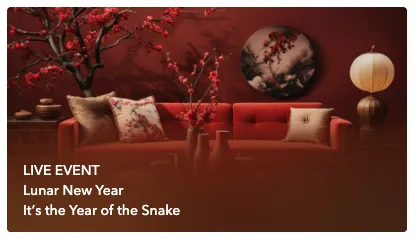
Here’s a great example of a Chinese New Year in-app event that feels premium, festive, and highly engaging. It was the Year of the Snake, but instead of going too literal and simply adding a snake visual, the team created a thoughtfully designed, culturally relevant creative that still clearly communicates the celebration theme without looking cliché.
Tip: Start preparing your Chinese New Year strategy early, so you have enough time for creative testing, implementation, and maintaining strong visibility with your seasonal assets throughout the extended holiday period.
February 14
Valentine’s Day delivers short but intense conversion spikes, especially for apps tied to:
- Gifts & Shopping (flowers, jewelry, experiences, Valentine’s day stickers)
- Photo & Video (romantic filters, couple collages)
- Lifestyle & Relationship apps
- Food delivery (dinners, date-night deals)
- Travel (weekend trips, getaway planning)
Visual themes for Valentine's Day
High-performing Valentine’s visuals
Apps that succeed during Valentine’s season lean on these universally recognizable themes:
- Hearts, in soft or minimal forms (avoid cartoonish unless your brand supports it)
- Roses and petals (often used subtly in backgrounds)
- Ribbons, bows, gift boxes
- Cupid arrows (works in playful categories)
- Warm color palettes: red, pink, rose gold, champagne, deep burgundy
- Soft lighting / bokeh (for a romantic mood)
Icon strategy for Valentine’s Day
Icon concepts that perform well:
- Small heart overlay on brand icon
- Pink and red gradient edition of your icon
- Ribbon gift badge for the Shopping category
- Two-heart interlock for Dating or Relationship apps
https://www.flaticon.com/free-icons/february-14

Valentine’s icon changes should be stylish (although of course it’s subjective) and minimal, not just cute. Subtle accents often outperform full redesigns in almost every category except maybe Photo & Video.


Screenshot strategy for Valentine’s Day
Screenshot #1 is the entire strategy.
Users that see or are looking for apps adjusted to Valentine’s Day make quick emotional decisions. Apps that perform best typically redesign only the first screenshot:
- Red/pink background variant
- Heart or ribbon element
- Short, emotional headline
- Visual that represents “for couples,” “for someone special,” or “for your Valentine”
Screenshots worth testing
- Red vs. pink vs. rose gold palette
- Heart overlay vs. gift-box overlay
- Minimal aesthetic vs. decorative romantic aesthetic
- One couple featured vs. product-only approach (Photo/Video & Shopping only)
A/B testing ideas for Valentine’s Day
Icons
- Heart accent vs. ribbon accent
- Pink-red gradient icon vs. brand-color icon
- Minimal heart outline vs. filled heart
Screenshots
- “Gifts for Valentine’s Day” vs. “Romantic Deals”
- Red palette vs. rose gold palette
- Illustration-first design vs. photo-first design
- Screenshot #1 seasonal only vs. first 2 screenshots seasonal
In-app events for Valentine’s Day
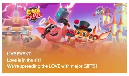
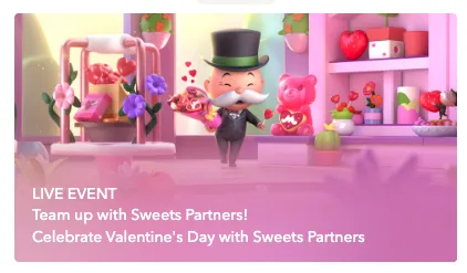
Surprisingly, Valentine’s Day in-app events perform exceptionally well for games. Limited-time quests, themed challenges, or special rewards tied to the holiday give players a fun reason to return, re-engage, and spend more time in the app during this period.

CPP experiments
Use separate custom product pages for:
- Gifts
- Photo editing
- Special Valentine’s Day filters
- Flower delivery
Tip: Pair each CPP with exact-match seasonal keywords in Apple Ads.
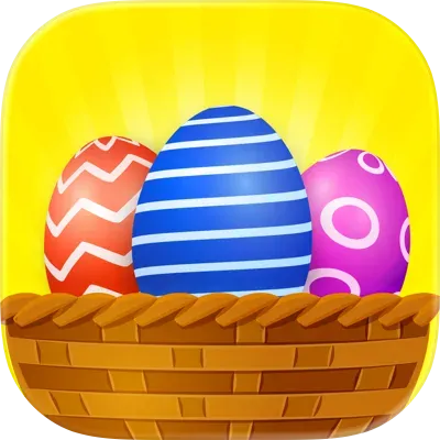
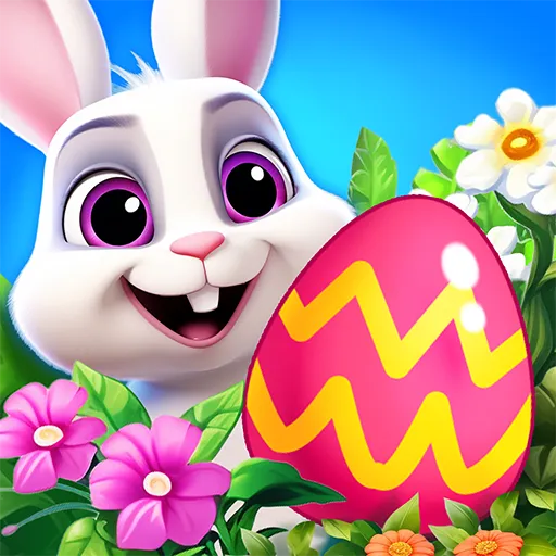
Easter
Easter isn’t as commercially explosive as Christmas or Black Friday, but it consistently brings a meaningful seasonal uplift, especially in regions where spring holidays are culturally strong (US, UK, Canada, Australia, parts of Europe and Latin America).
Apps in Shopping, Food Delivery, apps for kids, Education, Games, Lifestyle, and Photo & Video see the biggest benefit from Easter-themed creatives.
Easter visuals tend to be light, optimistic, and family-oriented, making them easy to integrate without clashing with brand aesthetics.
High-performing Easter elements
- Pastel colors (mint, lavender, cream, baby blue, soft yellow, blush pink)
- Easter eggs (decorated or abstract, used in backgrounds or accents)
- Spring flowers (tulips, daisies, cherry blossoms)
- Bunnies & chicks (works well in Games, Photo & Video)
- Grass and light spring textures
- Warm, family-centric scenes (for delivery, shopping, lifestyle apps)
https://www.flaticon.com/free-icons/easter
Icon strategy for Easter
Icon accents that work well:
- A small Easter egg tucked into a corner of the icon
- Soft pastel recoloring of your main icon background
- A tiny floral accent or bow (Shopping, Photo & Video)
- Bunny-ear overlay (Kids and Games categories only)
Screenshot strategy for Easter
For Easter, most brands adjust 1-2 screenshots rather than the entire set:
- Screenshot #1 with a pastel or floral background
- A headline referencing Easter or spring
- Optional: Easter-egg patterns or small seasonal accents
Effective screenshot captions
For Shopping:
- “Spring Deals for Easter Weekend”
- “Fresh Picks for the Holiday”
For Food Delivery:
- “Easter Brunch Delivered”
- “Family Meals for the Holiday Weekend”
For Photo & Video:
- “Easter Frames & Spring Filters”
- “Celebrate with Fresh Spring Colors”
For kids apps:
- “Playful Easter Activities”
- “Find the Hidden Eggs!”
A/B testing ideas for Easter
Icons
- Pastel vs. bright spring palette
- Egg accent vs. floral accent
- Minimalist spring version vs. more decorative version
Screenshots
- Pastel vs. bright spring colors
- Easter egg pattern vs. floral pattern
- One screenshot seasonal vs. the first two seasonal
- “Easter” headline vs. “Spring” headline (Spring often performs better because it’s less niche)
Ideas to A/B test for Easter
- Family-oriented positioning vs. Seasonal freshness
- Soft, airy backgrounds vs. Color-rich spring illustrations
- Egg or bunny motifs vs. Minimal spring accents
The Seasonal ASO Checklist
Use this checklist to plan, prepare, and execute every seasonal update smoothly, from concept to rollout.
1. Strategy & planning
- Identify which holidays are relevant for your category and target markets
- Review competitor activity from previous years (using tools like…)
- Define goals (CTR lift, conversion rate lift, feature promotion, re-engagement, etc.)
- Align seasonal ASO with marketing campaigns, paid UA, and in-app features
- Map out deadlines: hypotheses - design - review - A/B tests - implementation to the app store page - analytics
2. Keyword & metadata prep
- Research seasonal keywords (e.g., “Halloween games,” “Black Friday deals,” “Easter cards”)
- Validate search volume and keyword competitiveness
- Map keywords by locale: check cultural relevance
- Draft metadata variants for seasonal A/B tests
- Prepare localized metadata for key regions (if applicable)
3. Visual Assets
Icons
- Seasonal icon concepts (bold, playful, subtle)
- Test variants (e.g., pumpkin vs. bat, red accents vs. gold for Christmas/New Year)
- Ensure recognizability and brand consistency
Screenshots
- Seasonal themes and color palettes
- Highlight seasonal content/features
- Update captions with seasonal messaging
- Test seasonal-first vs. evergreen-first order
- Ensure accessibility and clarity in all locales
App preview video
- Update opening frames with seasonal hook
- Add subtle festive elements
- Keep runtime, pacing, and messaging consistent with platform guidelines
4. Custom product pages (CPPs)
- Create CPPs for specific seasonal search terms
- Align visuals and messaging with the holiday
- Sync CPPs with paid campaigns
- Set up measurement to compare CPP performance vs. default page
5. In-App Events / Promotional Content
- Plan App Store Events / Promotional Content for each holiday
- Write localized event descriptions
- Prepare matching event visuals
- Schedule submissions early (Apple review timelines may vary)
- Request a Nomination from Apple Editorial team min 3 weeks (6 months is better) before event time
Read our material about Promotional Content
6. A/B testing
- Identify which asset(s) to test (icon, screenshots, messaging, layout)
- Run tests early enough to collect meaningful data before the peak
- Monitor results and implement winning variants
- Document learnings for next year
7. Launch & monitor
- Submit assets for review ahead of time
- Confirm everything goes live before the peak search period
- Track keyword ranking, CTR, conversion rate, and CPP performance
- Monitor competitor updates across the holiday period
8. Post-Season Follow-Up
- Remove or roll back seasonal assets
- Compare seasonal vs. evergreen performance
- Record insights for next year’s playbook
- Share learnings with design, UA, and product teams
- Analyze which competitors have been featured and why
Conclusion
Key takeaways
- Seasonal ASO works because user intent shifts around holidays — aligning your creatives and messaging with these spikes helps you stay relevant, protect rankings, and capture short-lived demand.
- The biggest levers are usually icon + screenshot #1 and clear, seasonal value messaging. Metadata matters too, but only when it naturally fits your product.
- Timing is a competitive advantage: plan and test early, submit ahead of review bottlenecks, and localize by market rather than pushing global seasonality everywhere.
How to use this playbook
- Start with the Seasonal Calendar to pick the moments that match your category and top geos.
- For each holiday, use the sections on visual themes, asset ideas, and A/B test examples to build 2–4 strong hypotheses.
- Execute with the Seasonal ASO Checklist: research → creative concepts → testing → rollout → monitoring → post-season rollback and documentation.
Final note
Seasonal ASO doesn’t require a full redesign of the listing. Small, well-timed, well-tested changes — supported by CPPs and aligned with campaigns — are often enough to win the season, learn fast, and compound results year over year.