FTUE meaning: FTUE stands for first-time user experience, also written FTUX. It covers everything a new user sees and does in their first session, from the first open to the first moment of real value. A good FTUE gets the user to that value fast; a poor one is the main cause of day-1 churn.
Most apps lose the majority of their users in the first session. Not to a bug, not to price, but to a first few minutes that failed to answer the only question the user arrived with: what is this going to do for me.
That first session is the first-time user experience (FTUE, sometimes written FTUX), and onboarding UX is how you design it. This guide covers both, because treating them as separate disciplines is why so many apps have polished onboarding flows and terrible retention.
FTUE Meaning: What First-Time User Experience Is
FTUE stands for first-time user experience: everything a user encounters between opening the app for the first time and understanding why they should open it again. It starts earlier than most teams assume, at the store listing that set the expectation, and ends later than they assume, at the first moment of real value.
It is not the same as onboarding. Onboarding is the designed sequence you built. FTUE is what the user actually experienced, including the parts you did not design: the loading time, the permission prompt, the empty state, the moment they could not find the thing the screenshot promised.
The components of FTUE
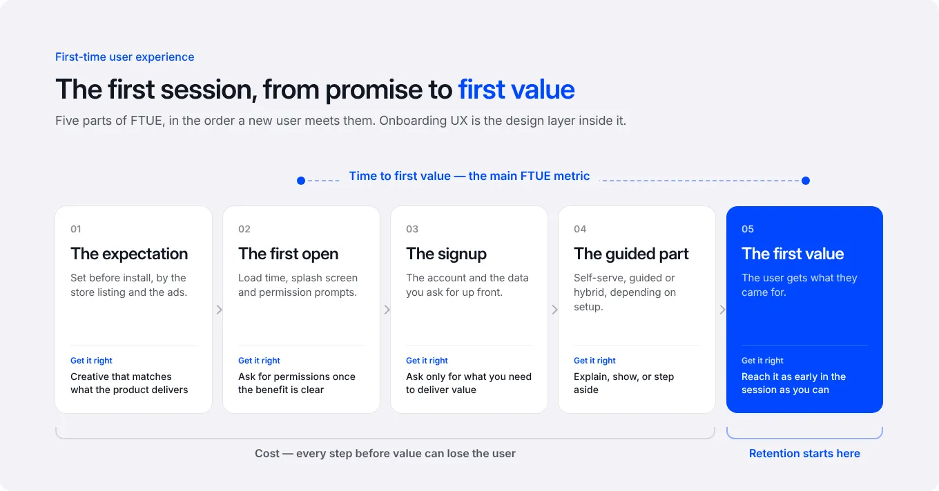
The expectation. Set by your store listing and your ads. A user who arrives expecting something you do not offer is already lost, and no onboarding fixes it. This is where acquisition and product meet, and where misaligned creative quietly destroys retention.
The first open. Load time, splash, permissions. Each is a place to lose people before the app has said anything.
The signup. Every field is a decision point and a reason to leave. Ask for what you need to deliver value and nothing more.
The guided part. Where you explain, demonstrate or get out of the way, depending on the product.
The first value. The moment the user gets the thing they came for. Everything before this is cost, and everything after is retention.
Why FTUE decides retention, activation and revenue
Activation and conversion. Users who reach value in the first session convert at a different order of magnitude from those who do not. The paywall conversion problem teams try to solve at the paywall often starts four screens earlier, which is why our conversion rate optimisation work begins with the first session.
Word of mouth. People recommend apps they understood quickly. A confusing first session does not produce a neutral user, it produces one who tells others it is confusing.
Retention. Early churn is mostly an FTUE problem, not a product problem, and the first place a retention and engagement programme should look. The user did not reject your app, they never saw it.
Onboarding UX
Onboarding UX is the design discipline inside FTUE: the sequence, the patterns and the copy that take a new user from first open to first value.
What user onboarding is
User onboarding is the deliberate path you build for a new user. It is a product decision before it is a design one, because the question it answers is what the user must understand before they can get value, and that is a question about the product.
What UX means in onboarding
Good onboarding UX reduces the work the user has to do to understand the app. Bad onboarding UX adds explanation. The distinction matters, because teams reach for a tour when the actual fix is making the thing self-evident.
The test is simple: if removing a step would leave the user able to get value anyway, the step is explanation and should go.
Types of onboarding in apps
Self-service. No guidance; the interface does the explaining. Right for simple, familiar products. Wrong when the value needs setup.
Guided. A sequence the user is walked through. Right when there is genuine configuration to do, such as goals, preferences or a profile that personalises what follows.
Hybrid (progressive onboarding). A short guided setup, then contextual help where it is needed. This is what most subscription apps end up with, because it collects what personalisation needs without front-loading everything.
The patterns, and when each earns its place
Progress bars. Make a multi-step flow feel finite. Worth it for anything over three steps. They do not make a long flow acceptable, they only make a necessary one tolerable.
Checklists. Effective after the first session, for setup that cannot all happen at once. They give the user a reason to return and a visible sense of progress.
Hotspots. Draw attention to one thing. Useful sparingly. Several at once is visual noise and gets dismissed as a group.
Tooltips. Explain a control at the moment it is relevant. Strong contextually, weak as a product tour, because a tour explains everything before the user needs any of it.
Empty states. The most underused onboarding surface in mobile. The screen a user sees before they have created anything is a chance to show what good looks like, and most apps waste it on an icon and an apology.
If you want the deeper version of walkthrough design specifically, that is its own topic: how to build product walkthroughs for your app.
FTUE Optimisation: Five Steps to Improve It
Make download and signup as light as possible
Every permission, field and account wall is a filter. Delay what you can until the user has a reason to say yes. The classic example is the tracking prompt: asked cold it gets refused, asked after the user understands the benefit it often does not.
Make it human, and resist the product tour
Write onboarding like a person explaining something to someone who just arrived, not like a feature list. The Peech case below is exactly this change, and it was worth 30% of LTV.
Use checklists for what cannot happen at once
Split setup across sessions where the product allows it. A checklist turns the remainder into a reason to come back rather than a wall at the start.
Know your audience well enough to skip steps
The fastest onboarding is the one that does not ask what you already know. Segment by acquisition source where you can: a user who arrived from a specific campaign has already told you something about their intent.
Gather feedback right after, not in a quarterly survey
The reasons people drop in the first session are visible in session recordings and in a one-question prompt at the point of exit. Both are cheap and both are skipped.
What this looks like in practice
Peech, text to speech, 30% increase in LTV. Peech's welcome screen was clear, concise and listed features. It did not answer what the user got out of it. We ran jobs-to-be-done interviews, rewrote the copy from feature-first to benefit-first, and A/B tested it against the original on first-time users in the US, 50/50, for 25 days.
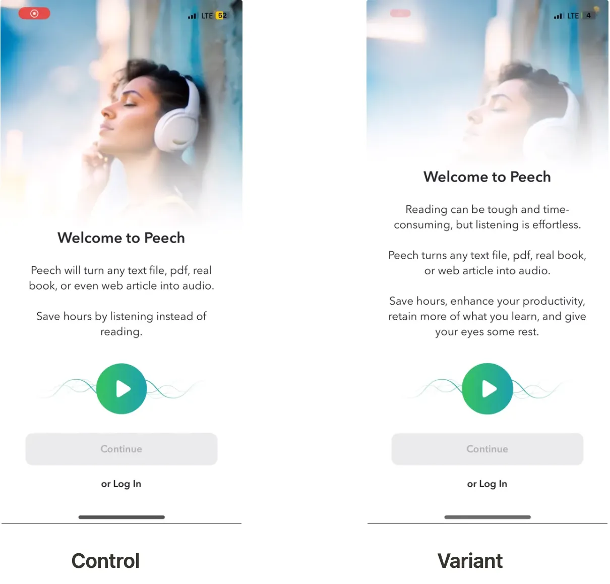
The new copy was almost twice as long, which in theory should have hurt it. It won anyway: a 30% increase in LTV, confirmed at 99.8% confidence. The lesson is not that longer copy wins. It is that copy answering the user's actual question beats copy that is merely efficient.
How to measure FTUE
Completion rate per step. Shows where people leave, which is almost never where teams guess.
Time to first value. The single most useful FTUE metric. Define the moment of value for your product, then measure how long it takes and what share of users get there at all.
Day 1 retention, split by onboarding path. If you run variants, this tells you which one produced users rather than completions.
Activation rate. The share of new users reaching the behaviour that predicts retention. Related and complementary: user activation in mobile.
A warning on completion rate: it is the easiest metric to improve and the easiest to improve meaninglessly. Removing steps raises completion and can lower activation, because you also removed the setup that made the product useful.
Common mistakes
- Explaining the product instead of making it self-evident
- Asking for permissions and data before giving any value
- Running the same onboarding for every acquisition source
- Optimising completion rate rather than time to first value
- Treating the empty state as a design afterthought
- Measuring FTUE quarterly rather than continuously
Conclusion
FTUE is the part of the funnel where acquisition spend turns into a user or evaporates, and onboarding UX is how you shape it. The work is rarely adding more explanation. It is removing the distance between opening the app and understanding why it was worth opening.
If you fix one thing, make it time to first value.
FAQ
What does FTUE stand for?
First-time user experience: everything a user encounters between opening an app for the first time and understanding why they would open it again. It covers more than the onboarding flow, including load time, permission prompts, empty states and the first moment of real value.
What is FTUX?
FTUX is another abbreviation for first-time user experience, used more often by UX designers. It means the same as FTUE: everything a user encounters in their first session with a product.
Is FTUE the same as onboarding?
No. Onboarding is the sequence you designed. FTUE is what the user actually experienced, including the parts nobody designed. An app can have a well-built onboarding flow and a poor first-time user experience, which is the most common version of this problem.
What is onboarding UX?
Onboarding UX is the design discipline inside FTUE: the sequence, patterns and copy that move a new user from first open to first value. It covers which type of onboarding suits the product, whether to use progress bars, checklists, hotspots or tooltips, and how much to explain versus how much to make self-evident.
How do you measure FTUE?
The most useful metric is time to first value, together with the share of users who reach it at all. Alongside it, track completion per onboarding step to find where people leave, and day 1 retention split by onboarding path. Treat completion rate carefully: it rises when you remove steps, including steps that were doing useful work.
How long should app onboarding be?
As short as it can be while still collecting what personalisation genuinely needs. There is no step count that is right in general, and the useful question is different: would removing this step still leave the user able to reach value? If yes, it is explanation rather than setup, and it should go.