Most subscription apps treat the paywall as a screen. It is closer to a pricing page, a sales conversation and a checkout compressed into about four seconds of attention, and it is the single place where everything upstream either turns into revenue or does not.
That is why paywall work pays back faster than almost anything else in an app. You are not acquiring more users, you are keeping the ones you already paid for. In our own work a paywall rebuild added 40% to ARPU for Fabulous within four weeks, and a single structured experiment added 9% to ARPU for Drops. Neither needed a new feature.
This guide covers the design decisions that matter, then shows six paywall formats with the trade-offs of each.
What a mobile paywall is and why its design decides revenue
A paywall is the screen where a user is asked to pay. In practice it carries four jobs at once: it has to explain what the subscription is, make the price feel proportionate to the value, satisfy the store's disclosure rules, and remove the specific doubt that is stopping this particular user. To see where your own numbers land, run them through our free LTV calculator.
The reason design carries so much weight is arithmetic. Paid traffic lands on a paywall after you have already spent the acquisition budget. A paywall converting at 3% against one converting at 4.5% is a 50% difference in revenue on identical spend, identical creative and identical targeting. Nothing else in the funnel moves that much for that little work.
There is also a compounding effect people miss. Conversion rate feeds back into what you can afford to bid, so a better paywall does not just lift revenue, it widens the set of channels and audiences that clear payback at all.
Five best practices for designing a paywall that converts
Lead with the value proposition, not the price
The first line should say what the user gets, in their words, not what the plan is called. "Unlimited workouts, personalised weekly" beats "Premium Annual". The plan name is a label; the value proposition is the reason.
The test that exposes this quickly: cover the price block and read the screen. If it no longer explains why anyone would pay, the paywall is relying on the price to do the selling, and price never sells on its own.
Be transparent about billing terms and prices
State the full price, the billing period, what happens when a trial ends and how to cancel. Both stores require clear disclosure, and burying it is also commercially counterproductive. Hidden terms raise the number of users who start a subscription they did not understand, which shows up a week later as refunds, chargebacks and one-star reviews.
Transparency and conversion are not in tension here. Users who understand what they bought churn less.
Set a minimum bar before you ask
Asking for payment before the user has experienced anything is the most common paywall mistake, and it is a product decision rather than a design one. The user needs enough context to know what they are buying.
This cuts both ways. Too early and conversion collapses because nobody pays for something they have not understood. Too late and you have given away the value and the paywall becomes a formality. Where the line sits is app-specific and worth testing directly, which is what paywall flow mechanics goes into.
Use design to communicate, not to decorate
Hierarchy, contrast and spacing should answer the user's questions in the order they ask them. What is this, what does it cost, what happens next, how do I get out.
The most common failure is a visually attractive paywall where the recommended plan, the price and the call to action compete for the same attention. If three elements are equally loud, the user has to do the work of deciding what matters, and some of them will decide to leave instead.
Make the trial length and what follows it unmistakable
If you offer a trial, say how long it is, what happens on the last day, and whether a reminder is sent. Ambiguity here is expensive in both directions: it suppresses trial starts among careful users and produces angry cancellations among the rest.
The anatomy of a mobile paywall
How many products to show
More options do not produce more conversions. Each additional plan adds a comparison the user has to perform, and comparison is where people stall.
The practical range is one to three. One plan removes the decision entirely and works when the offer is obvious. Three is the most that stays scannable, and only if one is clearly recommended. Beyond that you are asking the user to build a spreadsheet.
Weekly, monthly or yearly
The billing period you present changes which number the user anchors on. Weekly pricing produces a small, approachable figure and higher conversion, at the cost of shorter commitments and more cancellation points. Yearly produces a larger figure, more resistance and far better retention and lifetime value.
The usual answer is to show both and recommend one, with the per-week equivalent displayed under the annual plan so the comparison is done for the user rather than by the user.
Pricing and introductory offers
An introductory offer works when it lowers the barrier to the first payment without devaluing the product. A discount that appears permanent teaches the user that the real price is the discounted one.
Anchoring matters more than the discount size. The annual plan next to a monthly plan does most of the persuasive work on its own, because it gives the user something to compare against rather than an absolute number to judge.
Social proof and incentives
Ratings, user counts and short testimonials work when they are specific and plausible. "Join 2 million users" is weaker than a review that names the outcome the user is hoping for.
Placement is the lever people underuse. Social proof directly above the call to action addresses the doubt at the moment it peaks, which is not the same as putting it at the top of the screen where it is read as decoration.
Personalisation
A paywall that reflects what the user told you during onboarding converts better than a generic one, because it closes the gap between the goal they stated and the thing they are being asked to buy. If someone selected "sleep better", the paywall should talk about sleep.
This is also the cheapest personalisation in the app, since the onboarding answers already exist. Most teams collect them and then never use them again.
Paywall examples that convert
Six formats, what each is good at, and where each one fails. The format is a decision about how much comparison you are asking the user to do, and when.
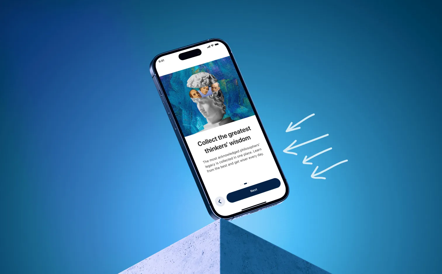
The standard paywall
The default: a value proposition, two or three plans, a call to action and the legal text. It is the right starting point for most apps because it is the easiest to test against and the easiest for users to parse.
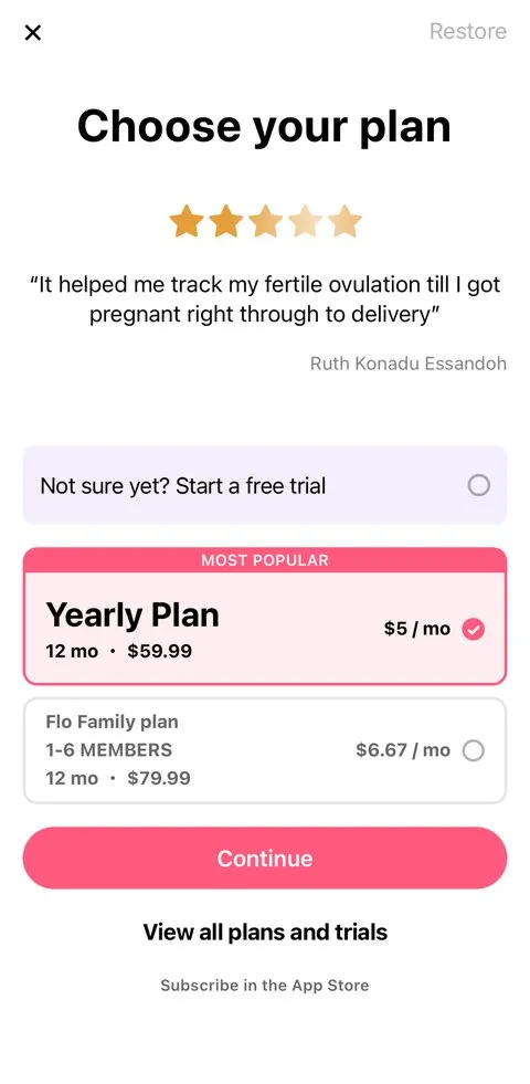
Good at: clarity, and being a reliable baseline for experiments.
Fails when: the app's value is not obvious without explanation, since this format gives you little room to argue.
Single plan paywall
One plan, one price, one button. Removing the comparison removes the most common point of hesitation.

Good at: conversion rate, especially on cold paid traffic where attention is shortest.
Fails when: your audience has genuinely different willingness to pay, because you are leaving revenue with the users who would have taken the more expensive option.
Multiplan paywall
Two or three plans side by side, one marked as recommended or best value.
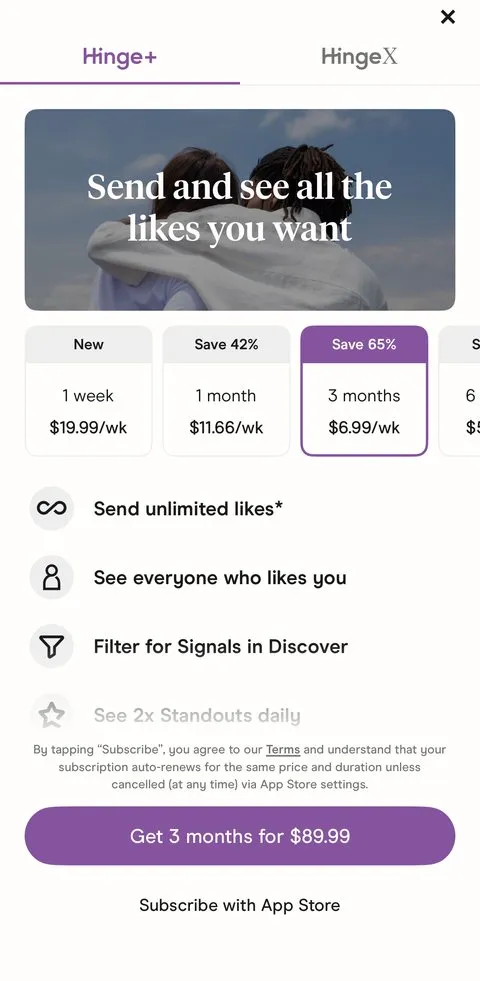
Good at: lifting average revenue per user, because the anchor does the selling and the recommendation does the deciding.
Fails when: the plans are not meaningfully different, which turns the screen into arithmetic homework.
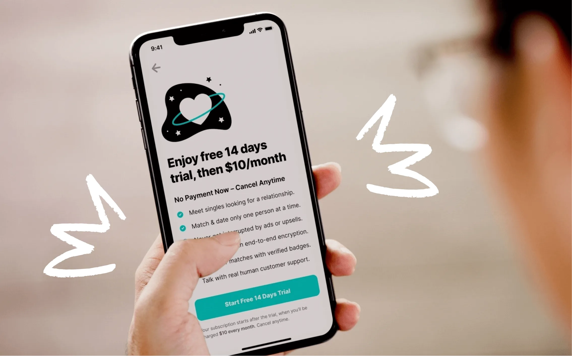
Trial toggle
A switch that turns the free trial on or off, usually with the price updating live underneath.
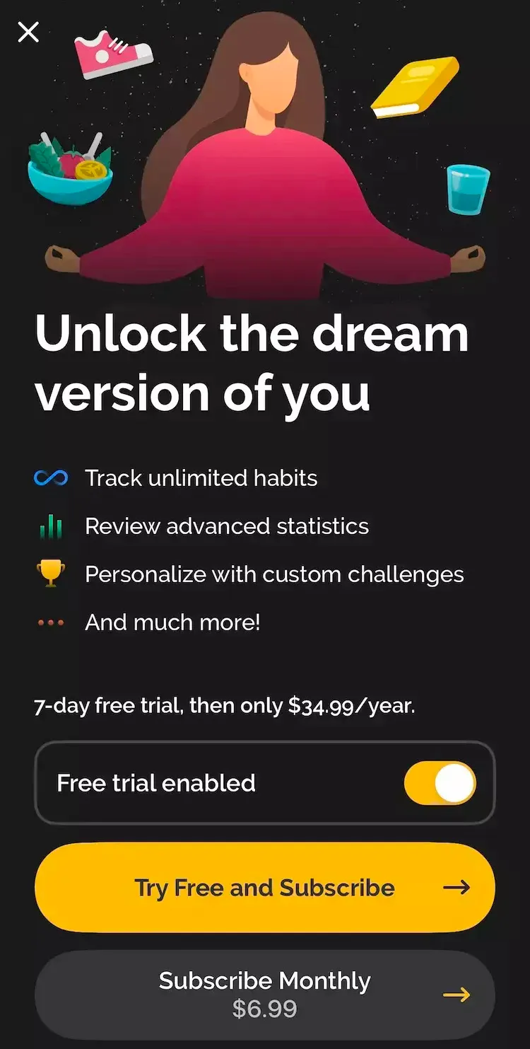
Good at: trial starts, and at making the terms feel like the user's choice rather than something being done to them.
Fails when: trial-to-paid conversion is weak, in which case the toggle efficiently manufactures users who never pay.
On iOS: since January 2026 Apple's App Review has been rejecting toggle paywalls, so on the App Store this format is effectively gone. It still runs on Google Play and on web checkouts. On iOS, show the trial as part of the plan instead.
Modal paywall
A sheet or overlay triggered at a specific moment, usually when the user hits a limit or reaches for a locked feature.
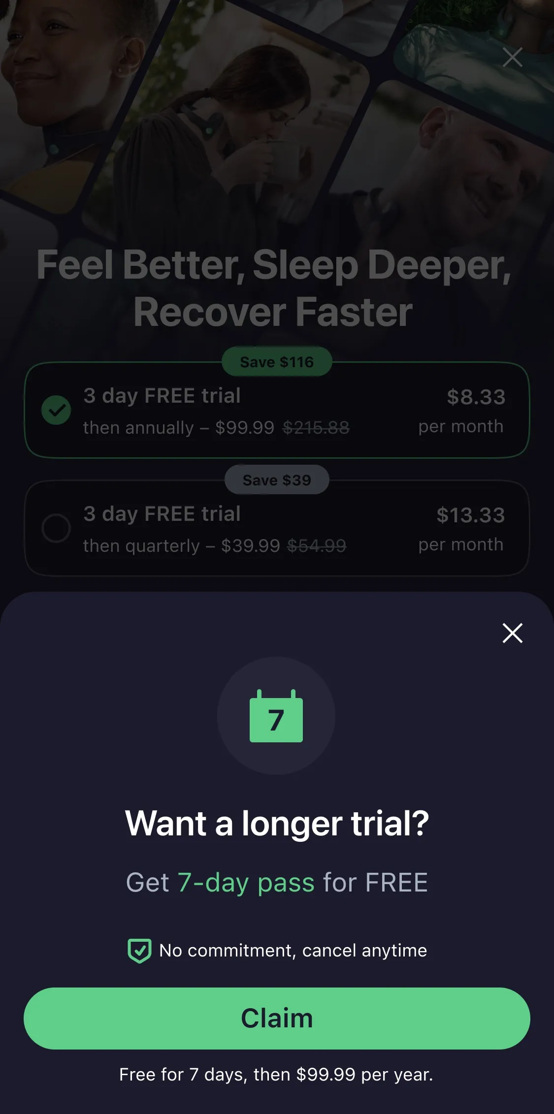
Good at: relevance. It arrives when the user has just felt the need, which is the strongest context a paywall can have.
Fails when: it is triggered too often or too early, at which point it reads as nagging and depresses both conversion and retention.
Landing page paywall
A longer, scrollable page with sections: benefits, social proof, comparison, FAQ, then the plans. Common in web-to-app funnels where the traffic is colder and the user expects to read.
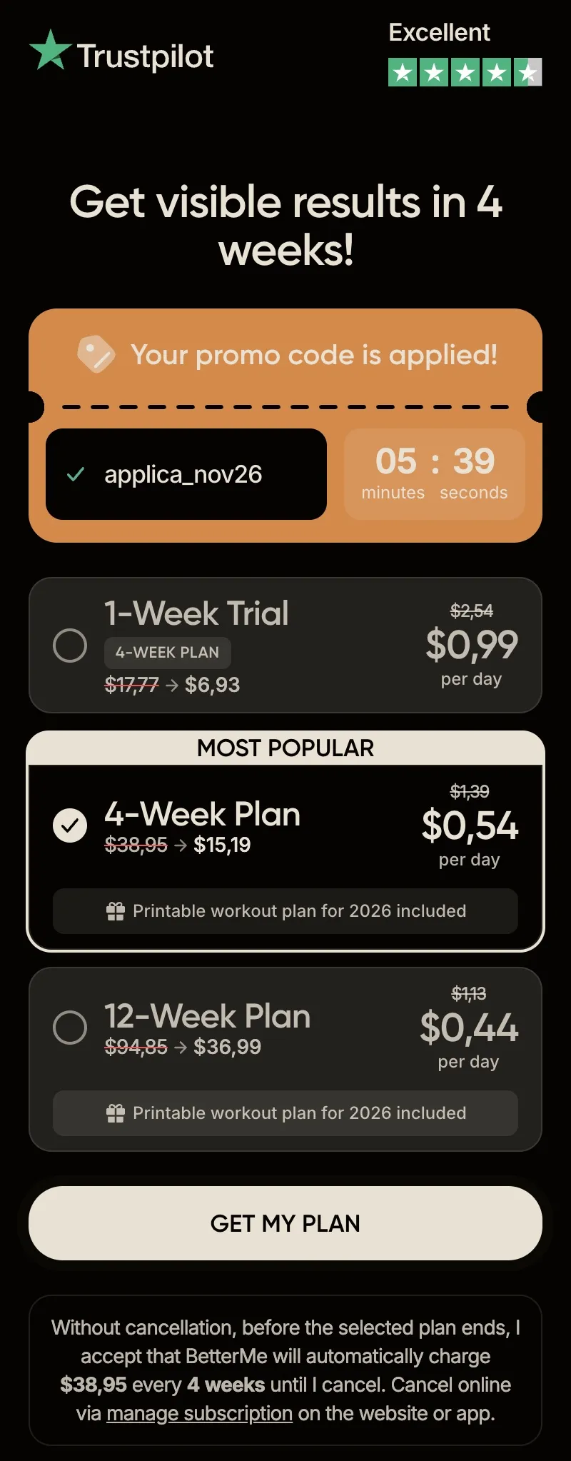
Good at: handling objections for a considered purchase, and for higher price points.
Fails when: it is used in-app after onboarding, where the user has already decided and the extra length only adds places to drop out.
How to choose between them
Match the format to how much the user already knows. Cold traffic that has never seen the product needs the argument, so landing page or standard. A user who has completed onboarding and hit a limit needs relevance and speed, so modal or single plan. An audience with a wide spread of willingness to pay needs the anchor, so multiplan.
Most apps need two paywalls, not one: an onboarding paywall and a contextual one. Running a single screen for both situations is the most common structural mistake we see.
Paywall copy, and why it moves more than layout
Copy is the cheapest paywall experiment available and usually the most underused. Three rules hold up consistently.
Write the benefit, not the feature. "Track your macros automatically" is a feature. "Stop guessing what you ate" is the reason someone pays.
Use the user's own words. Reviews, support tickets and onboarding answers contain the phrasing your audience actually uses. Paywall copy written from that material outperforms copy written from a positioning document, because it matches the sentence already in the user's head.
Say what happens next. Users hesitate at uncertainty more than at price. One line stating what happens immediately after the button is pressed removes a surprising amount of friction.
Make the cost comparison for the user
Users do not convert a yearly price into a weekly one. If you want the annual plan chosen, show the per-week equivalent under it and the saving against monthly in plain terms.
Two details matter. Keep the comparison honest, since inflated "save 80%" claims against a price nobody pays are both transparently false and a store risk. And keep it to one comparison, because two competing framings cancel each other out.
Analytics and A/B testing for paywall design
A paywall is never finished, and the difference between teams that improve theirs and teams that do not is almost entirely process.
Measure past the purchase. Conversion rate alone will mislead you. A paywall that lifts conversion while cutting retention or raising refunds has made the business worse. The metrics worth watching together are conversion rate, trial-to-paid, refund rate, and revenue per install.
Test one meaningful thing at a time. Button colour is not a hypothesis. Plan count, billing period emphasis, trial presence, the value proposition and the trigger point are hypotheses, and each is worth its own test.
Run for a full behavioural cycle. Weekly plans renew in seven days, annual plans refund in fourteen. Calling a winner before the relevant cycle has completed means calling it on incomplete data.
Segment the result. The same paywall often wins on organic and loses on paid, because the traffic arrives with different knowledge. A blended number hides this and produces decisions that are wrong for both segments.
For the tooling side of this, including which platforms support what kind of test, see best subscription paywall solutions for apps.
What this looks like in practice
Three paywall engagements from our own work, with what actually changed.
Fabulous, self care, +40% ARPU within four weeks. The work started as an audit of the web-to-app funnel rather than a redesign. The audit identified the growth opportunities, ranked them by expected impact on ARPU, and the new paywall strategy was tested from there. The uplift came from sequencing and pricing presentation, not from new features.
Dogo, dog training, +13% ARPU and +9.5% conversion rate. The problem was communication rather than layout. A product audit identified which benefits were failing to land, research established how to express them, and the paywall was rewritten per user segment. Clearer value, higher trial starts, more subscriptions.
Drops, language learning, +9% ARPU from one experiment. Drops had run paywall tests for several quarters without moving ARPU. The change was method: analysing why previous tests had failed, then splitting experiments into macro and micro levels rather than testing everything at once. One experiment then produced the 9%. It is the same method we bring to every learning app as an edtech app marketing agency.
The common thread is that none of the three was a visual redesign. All three were a diagnosis followed by a structured test, which is how conversion rate optimization works when it works.
Conclusion
Paywall design is not a styling exercise. It is the point where acquisition spend becomes revenue or does not, and small structural choices (how many plans, which billing period leads, when the screen appears, what the first line says) move the number more than any amount of visual polish.
Start by matching the format to what the user already knows. Make the terms unambiguous. Write the copy from the user's own language. Then test one meaningful thing at a time and measure past the purchase.
FAQ
What is the best paywall design for a subscription app?
There is no single best design, but there is a reliable starting point: a standard paywall with two or three plans, one clearly recommended, the annual plan shown with its per-week equivalent, and the trial terms stated in full. Test the format against a single plan version and a modal version once you have a baseline, because which one wins depends on whether your traffic arrives warm or cold.
How many subscription plans should a paywall show?
One to three. One removes the decision and usually wins on conversion rate. Three is the practical maximum that stays scannable, and only when one is marked as recommended. Beyond three, each additional plan adds a comparison the user has to perform, and comparison is where people stall.
Where should the paywall appear in the app?
After the user has enough context to know what they are buying, and ideally at the moment they feel the need. In practice most subscription apps need two: one at the end of onboarding and a contextual one triggered when a user reaches a locked feature or a limit. Running a single screen for both situations is the most common structural mistake.
Does a free trial improve paywall conversion?
It reliably improves trial starts. Whether it improves revenue depends on trial-to-paid conversion, which is the number to check before adding one. A trial toggle raises trial starts further still, which is good when trial-to-paid is healthy and expensive when it is not.
How long should a paywall A/B test run?
Long enough for a full behavioural cycle of the plan you are testing, so at least a week for weekly plans and at least two weeks where refunds are in scope. Call a winner on statistical significance rather than on a direction, and segment the result by traffic source, because the same paywall often wins on organic and loses on paid.