At WWDC26, Apple announced that a new class of image and video assets will appear in the product page header, in search results, in editorial features and in Apple Ads, all managed through a new Asset Library in App Store Connect and arriving this autumn. The visual real estate at the top of a product page is expanding. Most teams will meet that expansion with a creative library assembled by consensus rather than by evidence, because their App Store screenshots have been treated as a ten-slot design job for years.
That is the expensive part. Teams without a locked hero message have nothing to promote into the new space, and their listings in non-English markets stay frozen while Apple explicitly recommends localising screenshots and previews per market. The gap between a tested first frame and an untested one widens precisely when the surface grows.
One clarification first, because the number gets misread. The 80% in the title is a testing-bandwidth allocation, not a conversion-share statistic: it describes where your testing effort belongs, not what share of installs the first frame produces.
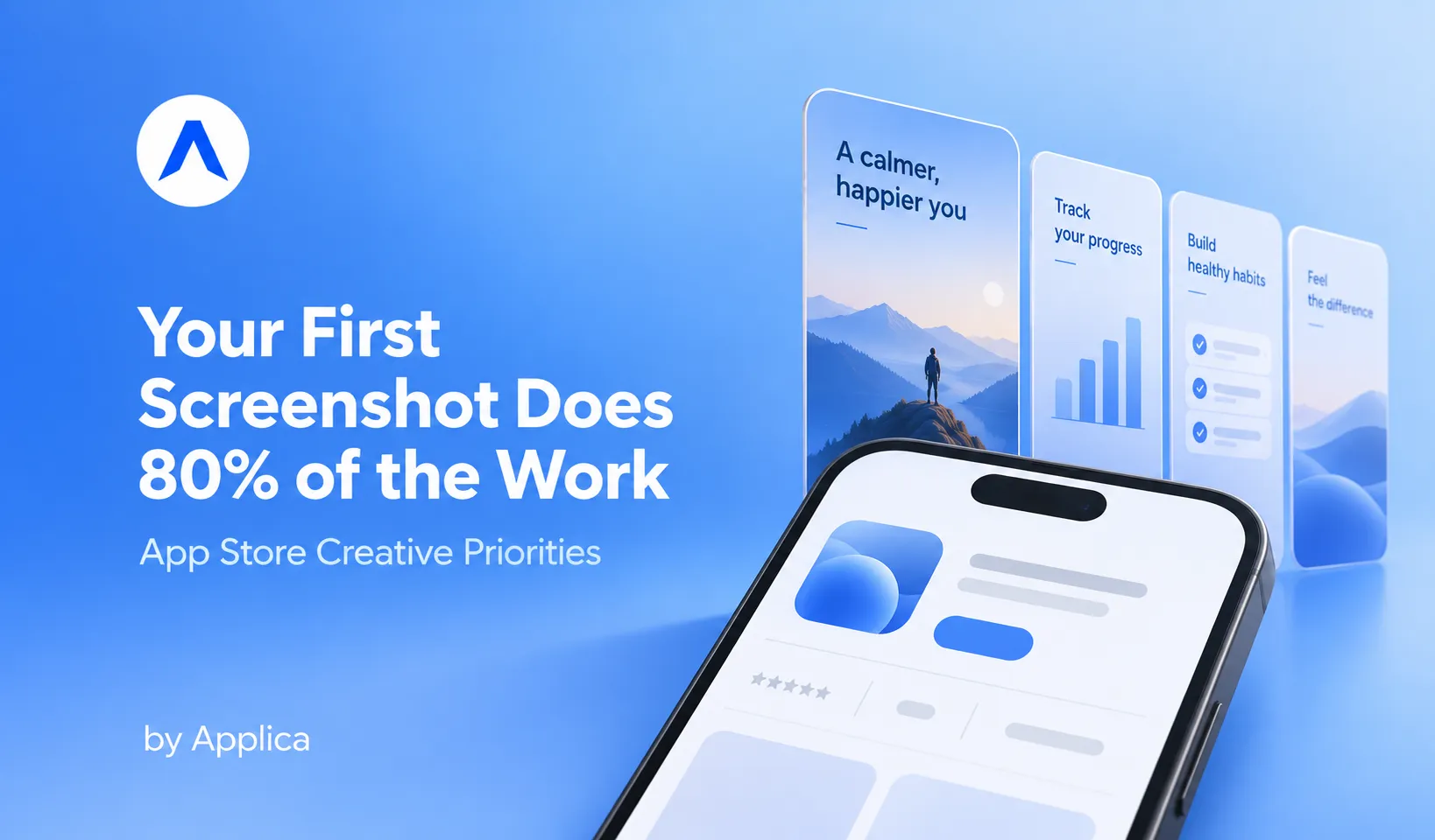
Here is the position this article defends: App Store screenshots are actually a three-tier priority decision, not a ten-slot design job, because the first screenshot drives most of the conversion decision, so your testing bandwidth belongs on frames 1 to 3, not the full carousel.
Why the first App Store screenshot does most of the work
The first screenshot carries disproportionate weight because it is the only creative asset that appears in both places a user can decide: the search result and the product page itself. Apple's documentation confirms that when no app preview is present, the first one to three images surface directly in search results, while all ten live only on the page a user has to actually open.
What the store surface actually shows a user
A product page has up to ten screenshot slots and up to three app previews. A search result has room for a fraction of that. This asymmetry is the structural reason the carousel is not a flat list of ten equal opportunities: frames 1 to 3 are doing double duty as both browse creative and search creative, while frames 4 to 10 are visible only to users who have already committed enough attention to open the app page or scroll.
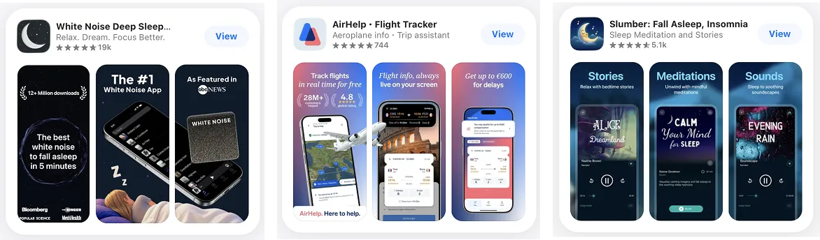
Orientation compounds it. SplitMetrics notes that a landscape video takes over the media preview area in search results entirely, which means the format decision you make on your lead asset changes what a searching user sees before any design choice does.
What the behavioural data says
The evidence for prioritising the first frame is behavioural, and it is consistent across independent sources. Apptamin's analysis puts roughly 70% of users as never exploring a product page past the first impression, with the typical download decision made in about seven seconds. AppTweak's screenshot testing research finds that under 2% of store visitors tap "read more" to expand the description, and its screenshot optimisation guidance holds that the first three images carry the most influence because users rarely scroll past them.
None of these figures says "the first screenshot produces X% of installs." What they establish is narrower and more useful: the population that ever sees your back half is small, self-selected, and already leaning towards installing. That is the honest case for reallocating effort, and it does not require a headline statistic to hold.
Three numbers that are not the same number
Precision here matters, because this topic attracts blended statistics that fall apart under scrutiny. Keep three things separate.
80% is testing bandwidth. It is an operating rule about where experimentation effort goes, sourced from how we allocate work, not a measurement of user behaviour.
The first-impression data above is behavioural. It describes how many users see what, and how fast they decide. It comes from third-party research on store visitors, not from Applica.
Roughly 70% is our share of win-driven lift. Across our client Product Page Optimisation activities, over 70% of the conversion lift produced by winning tests traced to iterations of the first screenshot. That is a statement about where our wins came from, not a claim about conversions in general, and it is covered in detail below.
Blending these into a single "the first screenshot is worth 80% of your conversions" line is the failure mode this section exists to prevent.
The three-tier hierarchy for your App Store screenshots
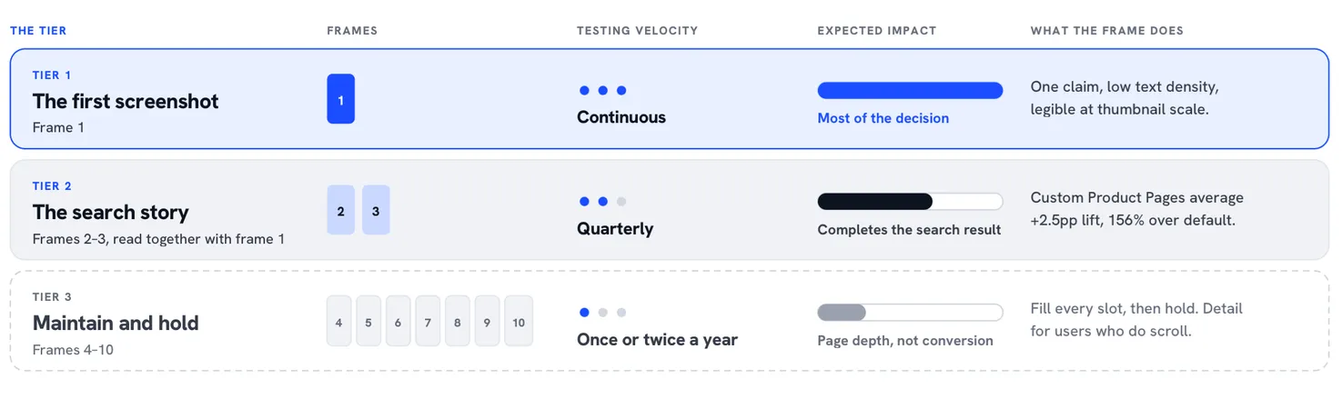
Treat the carousel as three tiers with different testing velocities rather than ten slots with equal claim on your design time. Tier 1 is the first screenshot and moves continuously. Tier 2 is screenshots 2 and 3, which travel with frame 1 into search results and paid placements. Tier 3 is screenshots 4 to 10, which are populated once and refreshed on a calendar, not a sprint.
Tier 1: the first screenshot, high velocity
Frame 1 answers one question: what is this, and why would I want it. One claim, low text density, legible at thumbnail scale in a scrolling search result. The common failure is treating it as a feature summary, which produces a frame that is accurate, dense and unreadable at the size it is actually consumed.
This is the frame that earns continuous testing. The discipline that matters is not volume but validity, which means testing creatives properly rather than swapping them and reading the result on the downstream metric rather than the first movement in the chart. A useful sourcing shortcut: your best-performing paid social creative has already been validated against cold audiences at scale, which makes it a stronger hypothesis for frame 1 than anything produced in isolation by a design review.
Tier 2: screenshots 2 and 3, the search story
Frames 2 and 3 exist to complete a story that begins in the search result. Because Apple can surface the first three images together, these three assets should read as one sequence, not three independent posters. A user scanning results is comparing your three-frame story against a competitor's, which is a different design problem from the one you solve on the page.
Tier 2 is also where paid and organic converge. Custom Product Pages let you run alternate screenshot sets against specific audiences, and Apple reports that custom pages deliver an average conversion lift of 2.5 percentage points, a 156% increase over default pages, with up to 70 variants available. In our own CPP tests the pattern that repeats is that the messaging frame, not the visual polish, separates the winners. Tier 2 gets aligned quarterly, in step with paid messaging, rather than iterated weekly.
Tier 3: screenshots 4 to 10, maintain and hold
Fill every slot. A complete gallery adds page value for the users who do scroll, gives your listing depth alongside well-structured listing metadata, and covers the feature detail that high-intent users go looking for. Then leave it alone. Refresh the back half once or twice a year, tied to brand overhauls or major UI changes, when the screenshots would otherwise misrepresent the product.
Continuous back-half redesign is not diligence. It is a misallocation of the scarcest resource an ASO team has, which is validated testing capacity.
Treat your store page like a high-velocity ad funnel, not a print brochure. You don't need to redesign all 10 screenshots every sprint: set screens 4 to 10 once or twice a year, then channel 80% of your testing bandwidth into your first screenshot and search result.
© Luisa, Head of Growth at Applica
App Store screenshots are actually a three-tier priority decision, not a ten-slot design job, because the first screenshot drives most of the conversion decision, so your testing bandwidth belongs on frames 1 to 3, not the full carousel.
Where the conversion lift actually comes from
The behavioural data explains why the first frame should matter. Our own testing data shows what happens when teams act on it.
The measured pattern across our PPO programmes
Across Applica's client Product Page Optimisation experiments, over 70% of total win-driven conversion lift came strictly from iterating the first screenshot. Isolated first-screenshot tests averaged a 14 to 22% CVR uplift. Tests confined to the back half of the gallery, screens 4 to 10, produced less than 1.5% measurable lift.
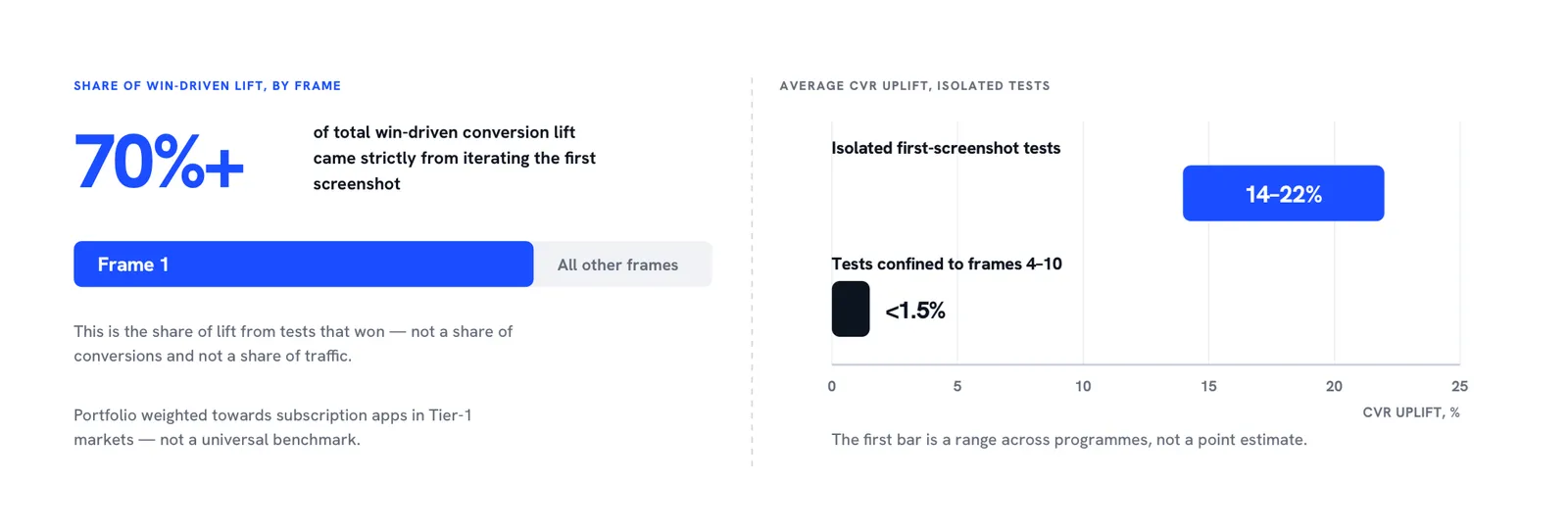
Three caveats, stated plainly because this figure is the spine of the argument and a mislabelled number would discredit it. These are directional cross-account results aggregated from client programmes, not a controlled causal measurement. The 70% describes the share of lift from tests that won, not a share of conversions or of traffic. And the ranges are our portfolio, weighted towards subscription apps in Tier-1 markets, not a universal benchmark you should expect to reproduce exactly.
Read alongside third-party results, the direction is consistent rather than exceptional. AppTweak's testing casework documents lifts in similar territory from creative changes, including Rovio's 13% conversion increase from a screenshot orientation change alone. The pattern is not that first-screenshot tests are magic. It is that they are where the addressable variance sits.
Why the back half still earns its slots
None of this argues for an empty gallery. Screens 4 to 10 serve the users who scroll, and those users convert at higher rates precisely because scrolling is a signal of intent. The argument is about velocity, not existence: populate all ten, then stop spending sprint capacity on them.
The distinction matters commercially. Back-half redesign work is visible, it produces a satisfying before-and-after in a review deck, and it is easy to approve. Frame 1 iteration is a smaller change with a harder readout. The work that looks most like progress is not the work that produces most of it, which is a large part of why the conversion half of ASO stays underfunded in teams that otherwise run disciplined growth programmes.
One pattern that repeats
The clearest version of this we see runs roughly as follows. A subscription app arrives with a full ten-frame gallery, recently redesigned, and flat conversion. The test roadmap starts with a first-screenshot rewrite that replaces a feature montage with a single outcome claim, sourced from a message already validated in paid social. The test wins. Subsequent tests on frames 5 through 8 return nothing measurable. At the end of the cycle, effectively the entire roadmap result traces to one frame, and the team's instinct to redesign the whole carousel would have spent the same budget for a fraction of the outcome.
That is a composite of a repeated pattern, not a single engagement, and there are no specific account figures behind it.
How many App Store screenshots should you test, and how often?
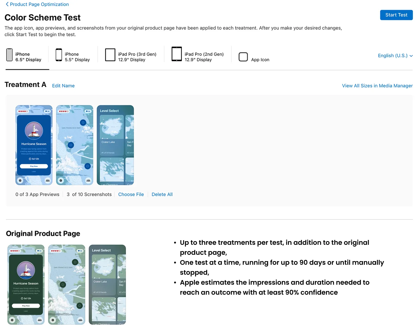
Apple's Product Page Optimisation allows up to three treatments tested against your original page, one test running at a time, for a maximum of 90 days, with results reported at a 90% confidence level before a treatment can be applied. That envelope, not your design capacity, sets your realistic testing cadence: roughly four to six well-powered tests a year on a mid-sized app.
Given that ceiling, the allocation question answers itself. If you can run four to six valid tests a year and you spend two of them on the back half, you have committed a third of your annual learning capacity to the region where measurable lift is smallest.
Most teams are not close to the ceiling. AppTweak's 2026 benchmarks found that only about 35% of top App Store apps ran two or more screenshot tests, and roughly 90% never A/B tested an icon or a video at all. The competitive bar is low enough that consistent, valid testing on one frame outperforms sporadic redesigns of ten. What "valid" requires is unglamorous: comparable conditions, one hypothesis per test, and enough traffic to reach significance, which SplitMetrics covers well in its test validation framework.
Keep platform figures separate when you set expectations. AppTweak's category data puts the US App Store average conversion rate near 8.6% against roughly 16.2% on Google Play. Those are different stores with different browse behaviour, and a target imported from one to the other will mislead your readout.
Localisation is the highest-yield screenshot work most teams skip
Localised screenshots are a separate lever from localised text, and the higher-value one. Apple's guidance is to localise app previews, screenshots, description and keywords for each market where the app is offered, and to tailor the creative to what resonates locally rather than translating what worked in English.
The mechanism is straightforward. A frame designed around an English headline usually breaks when the translation runs 30% longer, so the localised version ships with smaller type, tighter margins and worse thumbnail legibility than the original. The market that receives your least readable creative is the one where you have the least intuition about what converts. Cross-localisation, importing high-converting metadata and creative patterns between locales rather than translating in one direction, is a distinct discipline worth staffing properly.
Be careful with the numbers here. Multipliers claiming localisation doubles or triples downloads circulate widely and are hard to trace to a primary source; Apple's own documentation makes the recommendation without attaching a figure. The argument stands on mechanism and platform guidance, and there is no need to reach for a statistic that will not survive a reviewer.
How should you prepare for the App Store product page header change?
Apple announced at WWDC26 that new image and video assets will be able to appear in the product page header, in search results, in App Store features and in Apple Ads, submitted through a new Asset Library, with a Product Page Preview tool in App Store Connect for checking how the page renders before publishing. Apple has stated these are coming this autumn. Note the tense: this is announced, not shipped, and the specifics may change between announcement and release, so plan against it rather than building to it as settled fact.
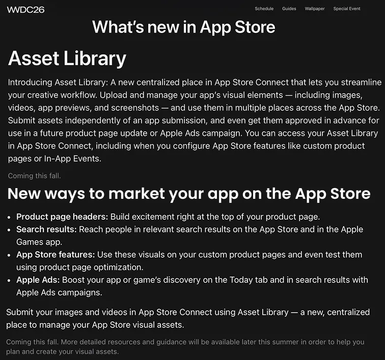
The preparation is not a new design project. It is an extension of Tier 1. A team that already knows which single claim wins on frame 1 has the input it needs for header assets, and can hand creative production a validated message to build horizontal variants from. A team still debating the hero claim will meet the new slots with a guess, in a market where competitive pressure on store surfaces keeps rising.
So the practical prep list is short. Lock the hero claim through testing now, while the current surface is still the one being measured. Build horizontal and video variants of the winning message rather than commissioning new concepts. And keep the header in the Tier 1 velocity band once it lands, because a new slot at the top of the page is not a new tier, it is more of the same tier.
The decision rule
Test frame 1 relentlessly, align frames 1 to 3 as one search story, populate and hold frames 4 to 10, localise the creative rather than the copy, and prepare horizontal hero assets before the header slots open. App Store screenshots are actually a three-tier priority decision, not a ten-slot design job, because the first screenshot drives most of the conversion decision, so your testing bandwidth belongs on frames 1 to 3, not the full carousel. The reallocation costs nothing to make, and it is the difference between a testing roadmap that compounds and one that produces attractive redesigns with flat conversion. If your first screenshot has not been tested in the last 90 days, that is where to start: explore what our App Store Optimisation work would find in your listing, or run the diagnosis yourself using the creative testing approach behind App Store CRO.