


Challenge
Onboarding clarity and homepage modernization
The Five Minute Journal app helps users cultivate gratitude daily, but its onboarding process struggled to clearly communicate its benefits. This, along with an outdated homepage design, led to low Day 1 retention and trial start rates.
Our challenge was to refine the onboarding experience and modernize the homepage to better align with user needs, improving engagement and conversion rates.
Solution
User Research and Feature Insights
We analyzed direct competitors in the journaling space to assess how their features and user experience addressed similar user pain points. This research helped us evaluate opportunities to optimize our app's functionalities, ensuring a more user-centric approach to design.
We mapped out user actions in the app and implemented Amplitude for in-depth behavioral analysis. Through this data, we discovered key insights about feature usage patterns.
We conducted user interviews to gather qualitative feedback on the app experience. These interviews allowed us to understand the struggles users faced during onboarding, how they interacted with features like journaling and mood tracking, and their perception of the paid customization features. The insights gained helped refine both our product messaging and design, ensuring a more intuitive and value-driven user experience.
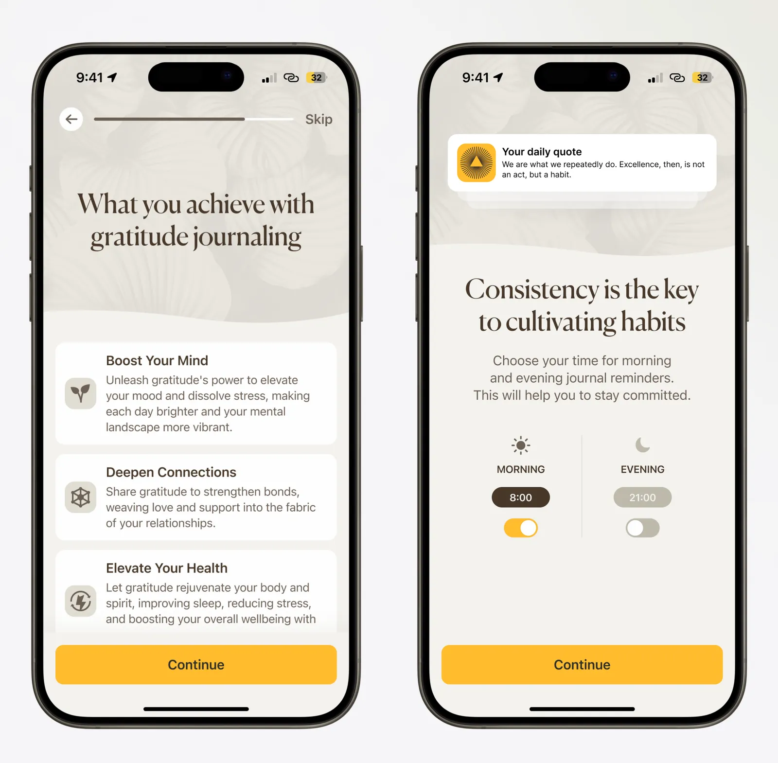
Onboarding Clarity Issues
We discovered that the value of the app was not being effectively communicated during the onboarding process, as the benefits of guided journaling were not immediately clear to new users.
To address this, we restructured the onboarding flow to better highlight the positive psychology principles behind the app and the long-term benefits of cultivating gratitude. This included clear messaging, interactive elements that demonstrated the app's core functionalities, and early exposure to premium features. We also added social proof elements to increase product's credibility.
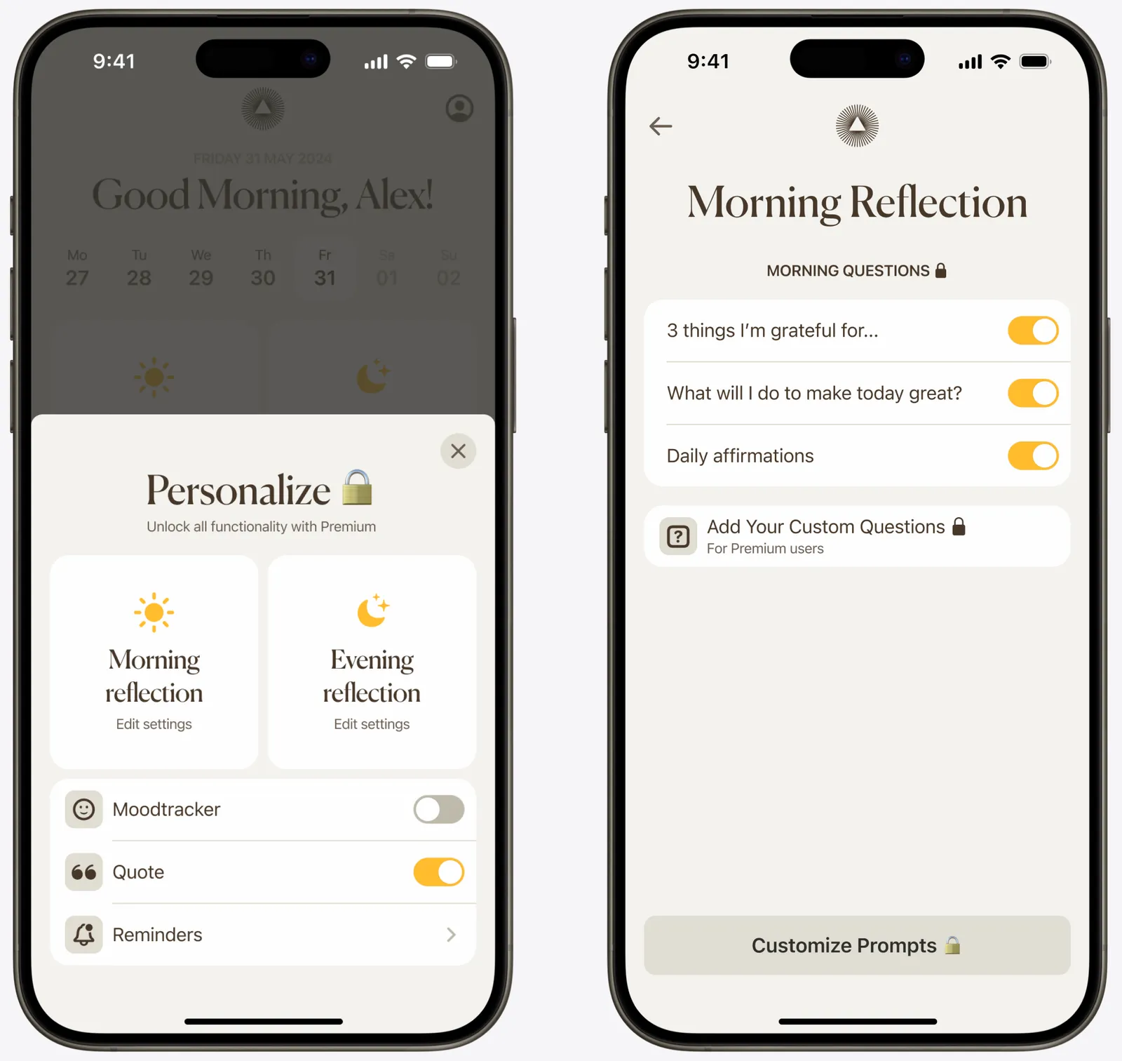
Low Adoption of Key Features
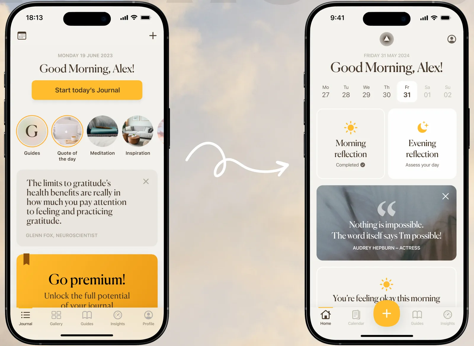
We identified that key paid features had very low adoption rates, being deeply hidden in the app. Though these features showed high engagement among users who did use them indicating an opportunity for improvement.
This led us to prioritize making these features more accessible on the Home tab. Additionally, the existing Home tab's complexity distracted users from core journaling actions, so a redesign was proposed to simplify the interface and increase user engagement with the core journaling experience.
Results
The onboarding trial start rate increased by 15%, leading to better user activation. Lifetime value (LTV) improved by 23%, reflecting higher user engagement and retention. By optimizing the home tab experience, day 1 retention reached 36%.
These insights drove refinements in onboarding, feature visibility, and user experience to enhance long-term user satisfaction and monetization.
+15%
Trial start rate
+23%
LTV
Client feedback
Increasing our ARPU is critical to scaling the Five Minute Journal app
Darius Mora
General Manager of App Division at Intelligent Change