

Challenge
A welcome screen that needed more warmth
Peech’s existing welcome screen was informative but focused on listing app features. While clear and concise, it didn’t answer the most critical question for new users: “What’s in it for me?”
Our hypothesis: Shifting from feature-focused copy to benefit-driven messaging would better connect with users, leading to improved retention and higher revenue.
Solution
The approach: copy informed by user research
We crafted copy that aligned with user motivations that we understood from carrying out user interviews, helping them immediately see the app’s value. Here’s how we approached it:
1. User interviews:
Utilising the JBTD framework, we structured the interviews to dig deep into users' needs and the jobs they wanted to get done.
2. Revised copywriting:
We replaced the original “features-first” approach with messaging that highlighted benefits—like how Peech helps users multitask or stay informed without stopping their day.
3. A/B testing for validation:
Audience: First-time users in the US
Split: 50/50 test weight between the original and revised copy
Duration: 25 days
The test: a user-centric rewrite
The original welcome screen had a pretty compact, easy-to-read, and informative text that described the main features of the app. The new copy provided more explanation on what the app can be used for but looked almost 2 times longer, which potentially could lead to a reverse effect since people tend to pay less attention to longer texts.
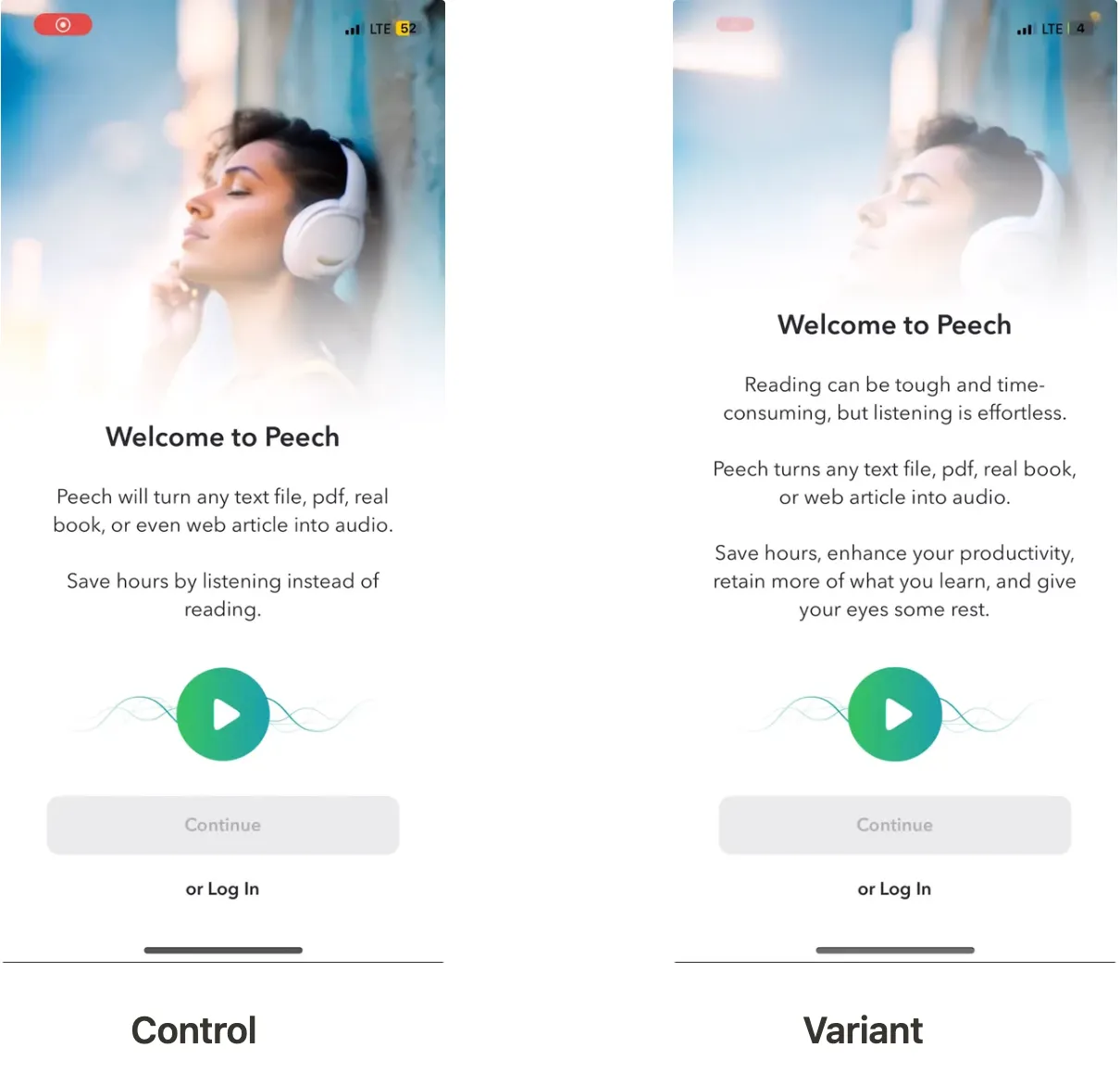
The variant version had more text but it was more user-led
Results
Despite its length, the new version of the text became a definite winner:
A 30% increase in LTV, was confirmed with a 99.8% confidence level.
Better initial user engagement, with new users immediately recognising how Peech could fit into their lives.
We ran it for 25 days to reach significance at the highest confidence level.
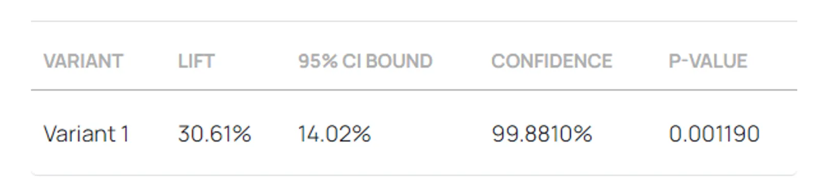
The hypothesis hit the spot with the 99.8% confidence result.
Why it worked: key takeaways
- Start with benefits, not features: Users care more about how an app solves their problems than about what it does.
- Small tweaks, big outcomes: Strategic optimisations don’t need to be complex. A minor copy adjustment can drive meaningful results.
- Test, refine, repeat: A/B testing with a single variable gave us clear, actionable insights, making it easier to understand what worked.
Conclusion: the power of small optimisations
Sometimes, it’s not about a complete overhaul - it’s about fine-tuning the details. For Peech, a simple copy tweak on the welcome screen turned into a 30% revenue boost, proving that even small changes can lead to significant results when paired with thoughtful strategy and precise testing.
30%
LTV increase
Client feedback
We ran loads of AB tests, and many of them demonstrated the rise in key metrics. I was impressed with the knowledge and experience Applica brought to the partnership.
Andrey Paznyak
CEO at Peech